Moving mute and still visuals
Reviewed by Gwen Herat
There is no need for the Sri Lankan artist in search of subjects to
go to history or mythology or for that matter, Sinhala literature. He
needs only to ransack the mysterious East and North and the boundaries
held within. He will find a rich harvest of subjects, waiting to be
reaped by the power of his brush. The colours are gorgeous but
unfortunately very few had the capacity to exploit its splendour.
 |
|
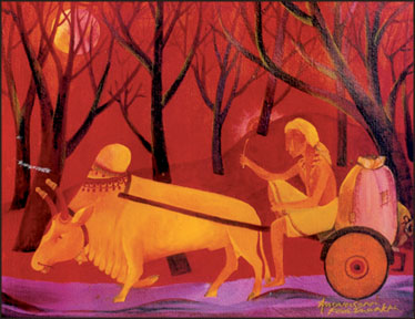
End of the day |
However, there is a boom of young and not so young painters
colourwashing their canvases and one such is Amarasena Kodituwakku who
held his seventh art exhibition at the Lionel Wendt, a few days ago.
To what extent he has improved from his last exhibition. I am unable
to say though faintly I can recall seeing some. But Kodituwakku has the
strength to move with time and face new challenges that arise from the
world of art.
He is genuine and retains the Sri Lankan identity though at times his
brush strays towards the Mogul traditions when he tries to deck and
decorate cart-bulls that give a different twist to the local animal.
It is very apparent in painting No.1 titled 'End of the Day'. There
is a glorious fusion of red and orange burn in the sky as against the
dark twigs of barren trees. But the bull is not what I would have
painted and the cart is so unlike the bullock.
Well, it could be an improvised cart in the mind of the painter who
put in a distinctive Mogul aura round its neck.
May be that Kodituwakku loves his animals and place them on a high
pedestal. This is a good painting for the drawing room for display.
Kodituwakku is a living example of the Sri Lankan painters that are
an amazing lot in that each and every one of them has their own
individual identity. The world of art is very intimidating and
self-effacing elitist place full of misconceptions which pry open the
world of art galleries around the world.
We have the capacity and the courage to stand up to any quality art
from around the world. Our problem is that there is no encouragement.
Visual objects
So, the painter suffers and frustrates. If our paintings can be
generated internationally and its stature elevated, painters such as
Amarasena Kodituwakku would have gained unparalleled heights and so are
the others. And, there is the issue whether our art can be represented
on the web because some visual objects do not properly translate on
line.
So, what do we do? We should exhibit them at international galleries
and our missions abroad should take the initiative. When Sri Lankan
painters come to the intersection of their career, most of them give up
in frustration unable to market their products and Sri Lanka loses
talented artists.
 |
|
Frustration |
All these aspects crossed my mind as I viewed Kodituwakku's paintings
which he exhibited for the seventh time titled Yugaya. He is a good
artist of his generation and he can inspire the up and coming
youngsters. His visual charm, at times, gets mute and still, like a
moving visual on TV that freezes for a moment, and next it springs back
to life.
This I noticed in his figures that captivate the 'feel' put in by the
artist. His colours are sharp and at times over exposed whereas had he
subdued his brush, the effect would have surfaced better.
But then artists have their own colour-mixing which differs from how
we look at them. Probably, bright, sharp and brilliant colours may be
his forte.
His colour variations are truly his own identity and speak highly for
his creative talent. He attempts to stick to conventional art than give
way to modern or contemporary. There are no cubism, mythological or any
form of impressionism as he leaves his signature.
Humility
The simple, unaffected artist who is full of humility struck me for
his genuine contribution towards the culture of art. He deserves a
better place than where he is now, But who will lend our artists such
encouragement? Kodituwakku was awarded the prestigious Kalabooshana
award in 1997.
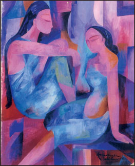
Some of the paintings that caught my eye were: No. 9 - Relaxation - A
woman in soft colour scheme of grey and pink, very cleverly mixed to
effect clarity of line and space. No.13 - The right path - Once again
his favourite colour combination of grey and pink but with the bold
addition of faces in green. I thought the painting was very unusual with
its black background. No.19 - Frustration - I did not observe any
frustration in the picture let alone on the figures. It was a beautiful
piece of art work in blues and pink. No.32 - Swinging thoughts - Swing
high; swing low. What was it that went though the artist's mind when he
painted delightful belles. The painting should have been less colour
oriented.
|


")

