The beauty of seeing patterns of light and shade
by Tissa Hewavitarane
Light is something created by the sun illuminating the earth’s
atmosphere and filtering my and falling gently to the surface.
Therefore, we as artists need light to paint. Light comes in many forms.
Light has colour and differing intensities.
It can be direct or reflected. It can define local colour or obscure
and alter conditions that can made you a better painter.
Depending on the nature of the day, reflected light can be a very
important part of your painting. The most dramatic and instructive
approach to the idea of “designing with light” is to begin by
exaggerating the contrast of light and shade.
 Seeing the shape of shade is not as easy as it sounds. Several
hurdles must be cleared before patterns of shade can be accurately
observed and subsequently painted. Seeing the shape of shade is not as easy as it sounds. Several
hurdles must be cleared before patterns of shade can be accurately
observed and subsequently painted.
The first is to disengage the brain. This is not something I suggest
you to do in excess, but it is helpful when the objective is to observe
clearly.
The brain has too many options as to what you should see and often
overides what your eyes actually see. The second hurdle is to disregard
local colours and surfaces that absorbe light, making it difficult to
observe light.
The perception of colour is directly related to the reflection of
light waves. Dark surfaces absorb much more light than as light struck.
Surfaces such as roof shingles, grass foliage also absorb light from
direct sunlight.
Power of light
Depending on the nature, of the day, the reflected light can be very
important to your painting.
The strong colour is the most expressive element in the artist’s
vocabulary. To relegate colour to a secondary role is to communicate
with half a vocabulary.
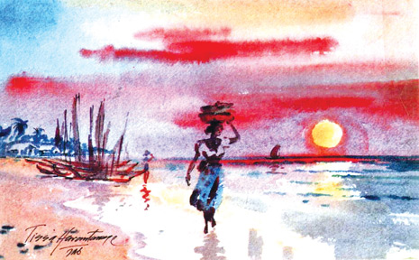
Observe the differences I have applied on the painting reproduced
here. I have expressed the colours what I felt and understood of the
entire landscape. I have titled it ‘Evening Shadows’.
You will notice that the sky at sunset takes a radiant glow which
even the brightest pigment colours can never hope to match. Therefore,
the artist must use his skills to create the illusion of radiant light
in his painting.
One way to do this is by including both warm colours in the sky,
because a warm colour always appears warmer and brighter when placed
next to a cool colour.
In the ‘Evening shadows’ see how the artist interweaves the warm
pinks and golds of the setting sun with the cool blues and violets of
the clouds. In addition, notice how the dark tones of the sea shore
accentuate the brightness of the sky.
Transparent pigments
When painting sunsets use pure, clear and transparent pigments which
allow light to reflect off the paper and up through the colours thus
increasing the impression of light and luminosity.
Colours such as cadmium red and orange are used sparingly because
they are relatively opaque. A suitable palette of transparent colours
might include vermilion alizarin, crimson, lemon, yellow and cobalt blue
that will result in creating a good painting.
Lively colours
Resist the temptation to overblend your colours you are an artist,
not a house painter! Overblended colours look flat and dead, whereas
loose brushstrokes and partly blended colours lend character and energy
to a sky painting.
The paint was kept this and transparent, allowing the red and violet
washes. This whole picture appears to sparkle with light and colour.
You will notice a grove of trees at a distance casting dark shadows.
The colours and tones on trees of a dark texture give strength and
stability to the painting.
Notice a row of fishing boats that gives an added attraction and two
women along the shore with fish basket on their heads giving life -
movement and scale to the picture. ‘A large stretch of water on the
surface is made very light where its farther away and dark in the
foreground.
The perception of colour is directly related to the reflection of
light waves.One of the most attractive qualities about watercolours is
the ability to express even the most transient effect of light colour
and atmosphere found in nature.
The appeal of this painting ‘Evening Shadows’ lies in the delicate
transition from pale delicate washes to strong bright colours. Dark
shades are much effective in the background.
To get more expressive power into your painting its vital to put
more, energy your brush strokes.
To achieve this energy without losing control of the medium requires
skill and this can only be gained through constant practice and
dedication.
|


")
