The right way of painting water
by Tissa Hewavitarane
The secret of painting water is to "edit out" all the superfluous
details and go for the bigger masses of tone and colour. You've probably
heard the saying, "Less is more" and nowhere does this apply more
readily than in the painting of water.
Achieving the smooth glassy look of water requires surprisingly
little effort, often a few sweeping strokes with a broad brush and damp
paper are enough to convey the effect you need to show water.
Water like clouds is usually in motion so you must observe the way it
looks at one instant and catch that on paper. One nice thing about water
is that it has a rhythm in its movement and will generally repeat the
sequence so you can catch that feeling again and again.
 Still water is like a horizontal mirror. Stream water moves, tumbles
and flows. Study its movements carefully and then paint a generalisation
of its movement. The brushstrokes should follow the action of the water. Still water is like a horizontal mirror. Stream water moves, tumbles
and flows. Study its movements carefully and then paint a generalisation
of its movement. The brushstrokes should follow the action of the water.
Motion
Do not put down every rock and ripple since rushing water looks best
when understated. The lack of detail immediately brands it as a rapidly
moving stream. The only way you might catch its "one movement" is to
photograph it and that might be a good way to work.
Open sea water and crashing surf are in constant motion, but it is a
recurring movement. Sea water has no colour of its own (it is clear) but
reflects the colour of the sky overhead.
The rougher the water the darker the colour, but seas are usually
darker than the sky above.
Generally the sea is darker up close and lighter as it reades, un
less the sky conditions cause a variation. Remember that the ocean is
flat, so you should keep your brushstrokes horizontal and not at various
angles.
Waves appear greenish. The white spray splash, caps and surf can be
masked out at first to preserve the whiteness or it can simply be left
unpainted.
Surface
Whether you apply your colours to dry or damp paper is a matter of
preference, but choose your colours with care and apply them with
confidence. The more decisively and simply you paint water the wetter it
looks.
Therefore, try to work with large brushes that discourage the habit
of fiddling and prodding.
Use plenty of water to facilitate smooth even strokes. Mix your
colours carefully and test them on scrap paper before applying and
remember that they should appear quite dark in tone to allow for the
fact that they will fade a lot on drying.
On large stretches of water the surface is made very light where it
is farther away and dark in the foreground.
This is because the horizon reflects the low lighter part of the sky,
but close to the shore the water picks up the darker colour from the sky
like a mirror but rough water picks up and relays the light form many
directions, either darker or lighter than the sky depending on the
prevailing conditions.
Water in a stream tumbles in some parts and flows in others. Before
painting a stream watch its movements very carefully for a long time and
then paint a generalisation of the movement.
Brushstrokes should follow the action of the water. Do not put down
every ripple because rushing water looks much better when it is
understated and the absence of detail gives an impression of rapid
movement.
River
When the water is muddy it reflects the colour of the sky, be it blue
or stormy grey. Secondly, it reflects the things that surround it,
trees, earth and bridges, all of course upside down.
One thing that has dawned on me over the years is just how little you
need to do when you are painting a river.
To make it look authentic, whole areas can be just left as a flat
wash. But there are a couple of tricks which I always find most
effective when I depict rivers. One is that where the river goes round
the bend I leave a little patch of light which seems to give a little
air of mystery.
Another process which is quite good in putting depth into a fairly
flat river is to turn the picture upside down, wet the whole river area
with clean water and immediately put a strong dark across what is now
the top, graduating it down to nothing as it comes to the end of the
river.
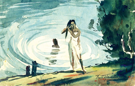
Once it is dry, turn the picture upright and you get an exciting
illusion of depth. Observe the painting I have done here. Reflections of
a post in completely still water and in disturbed water.
A post sloping away will produce a shortened reflection while one
sloping forward will produce an elongated one.
Note how the large ripples are shown with brushstrokes and the action
of the water. It was the last decision as to whether to put a figure or
not.
Whatever you do in different ways it gives life, movement and scale
to a painting and the tree on the right gives more depth. |


")


