|
Learn to draw by Tissa Hewavitarane
A better sense of depth in the sky
The laws of perspective apply to the sky just as they do to the land
- yet many perfectly good landscape paintings are ruined by a sky that
looks like a limp curtain hanging at the back of the scene. There are a
lot of mistakes done when painting the sky. For example, some skies
appear vertical.
The clouds are too similar in size and shape and too evenly spaced,
destroying the illusion of the sky receding into the distance. Another
mistake some artists make is placing the horizon line to high up, so
that the land competes with the sky for attention. If you want the sky
to be the main feature, lower the horizon line so that the land become
subordinate.
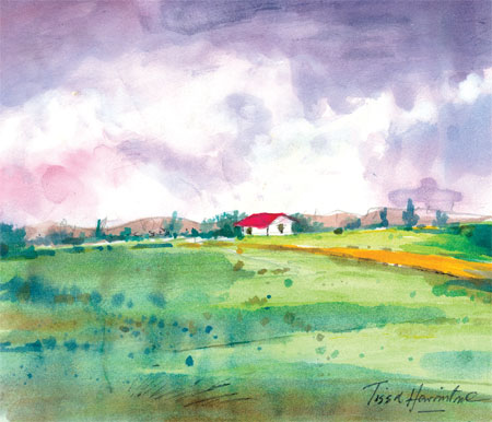
When the picture is composed, with a low horizon line, it makes us
feel involved in the scene as if we were actually standing in the field
looking at the heaped clouds advancing towards us. Clouds usually appear
smaller, flatter and closer together as they recede into the distance,
often merging into a haze at the far horizon. Perspective can be
heightened even further in your painting by making the nearest clouds
much larger and taller more clearly defined than the others.
In creating a sense of perspective in the sky, it helps to think of
it as a vast dome stretched over the landscape, rather than the mere
backdrop to it. Creating this dome like impression means applying the
laws of atmospheric perspective as well as linear perspective. As we
look into distance, intervening particles of dust and water vapour in
the air cast a thin veil over the landscape and sky, making them appear
greyer and less distinct.
Reproducing the effects of aerial perspective in your sky paintings
will greatly increase the impression of depth and atmosphere. Note how
everything is designed to lead the eye to the focal point. Even the
clouds are designed to lead the eye down to the mountains and on to the
house at the distance.
The impression of depth is much greater, too, because the row of
trees take us into the picture.
The whole picture is beautifully choreographed in the interest of
making a more balanced and coherent image. I have used 180 lbs Kent
drawing paper using soft sable hair brushes Nos. 2, 3, 8 and 12 and
three colours used with ultramarine blue, Lemon green with burn Sienna. |


")


