Painting on metal, the right way
by Tissa Hewavitarane
There are strong similarities between metal and glass, though in a
sense they are opposites. Both have hard, smooth and reflective
surfaces, but while metal reflects all the light falling on it, glass
lets most of it through.
One of the most difficult problems for painters, no matter how good
they are, is to try and make sense of a confused jumble of indeterminate
tones. Carefully look into the surface of most metal surfaces and that
is usually what you will find. Whether you are simply drawing one object
or tackling a still life which includes reflective surfaces, you will
need to consider now to simplify and clarify the subject.
Clarity
This can be done by paying special attention to the lighting.
Remember that the slightest change in light and its intensity will alter
the appearance of reflective surfaces and textures.
Strong, direct light will tend to give hard and vivid contrasts,
while softer light will break up the tones, giving more subtle effects.
|
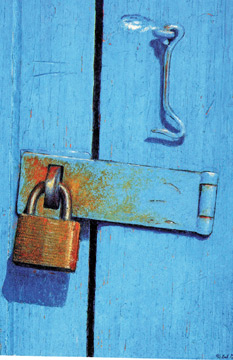
A watercolour painting showing the rough surface of metal |
Although generally, the stronger light will give you more clarity, it
will also give you darker and more hard-edged shadows and it is not
usually advisable for subtle textures where you need as much information
as possible.
You can conduct your own experiment with this by comparing the
texture of metal seen by a bright light and the same one lit by
candlelight. In the soft, low light of the candle the eye becomes much
more sensitive to the slightest nuance of surface texture.
I find that one of the simplest ways to experiment with light sources
is to place the object or objects on a tray so that the composition
remains undisturbed and can be transported to different locations around
the house. Sometimes by changing the light the whole idea of the
painting can alter.
Backgrounds
In any still life group and even a drawing of an isolated metal or
glass object is a still life. The background is of great importance, and
in the case of metal and glass can help you bring out the reflective
qualities of the objects.
The smoothness of a copper pot or silver jug, for example, might be
stressed by painting it against a rough-textured wall or a heavy fabric,
while a plain, dark background would provide an element of contrast to
make highlights and tonal contrasts in the subject stand or more
strongly.
Media and methods
Since metal and glass are smooth surfaced and essentially quite
simple in texture, they can be rendered equally effective in most
drawing and painting media.
However, wish each media, some techniques and methods are more
suitable than others.
Although any drawing medium can be used with the possible exception
of pen and ink, whose linear quality does not tend itself well to
establishing broad areas of tone, high contrast and detailed pencil
drawing is perhaps the most sympathetic and adaptable. In a detailed
pencil drawing you can begin to come to grips with the subtleties of
highlight and reflection.
Make sure you use a good quality, heavy cartridge paper, at least 150
gsm. I find it easier to draw on a slightly rough paper as this gives a
slight resistance to the pencil.
Very smooth paper makes it more difficult to build the tones, as the
pencil tends to skate on the surface.
Ensure also that the drawing can be erased without damage to the
surface of the paper.
You can test it by scribbling on the side with the pencil you will be
using and then erasing the marks. In pencil drawing the eraser is more
than a tool for correcting mistakes. It can also be used positively to
work back into the drawing.
Pastel
Although precise detail is more difficult to achieve with pastel than
watercolour or oil, the versatility of the medium makes it suitable for
rendering most textures, including shiny, reflective surfaces. Remember
that a heavy build up of blended colour will give the smoothest effect.
If you can use the surface qualities of pastel to suggest contrasts
of textures, for example blending the colours for glass and metal
objects and applying looser, rougher marks for other elements, such as
the back ground of the table top.
The effects of blending depend to some extent on the implement you
use. Try as of brush, a rag or your fingers and see which is most
effective pastel artists who use colour thickly, building it in layers,
usually apply fixative between stages to allow the new colours to adhere
to the old ones.
Another useful pastel technique is to spread the colour out over the
paper by brushing clean water over the marks made with pastel, which
gives an effect like that of combing pastel with water colour washes.
This could be ideal for diffused highlights, where you want a
delicate effect to contrast with thickly laid and overlaid colour.
Watercolour
A successful watercolour of metal should be as fresh and sharp as the
forms it is describing. You can eliminate any unnecessary detail so that
you can approach to painting with confidence.
A watercolour will record every step you make, so it is essential to
paint with a clear idea of what you are doing. Mistakes cannot be easily
rectified.
Before you begin, look carefully at your subject to see whether there
are any small highlights you can safely leave out, for example, or
several mid-tomes you could merge into one.
One of the most useful techniques for clear, sharp effects is wet on
dry, which simply means laying a wash, allowing it to dry, and then
laying further washes on top.
Wet into wet techniques can provide interesting effects in rendering
more opportunity to vary the texture of the paint itself. |


")
