The secret of painting water
by Tissa Hewavitarane
Why is that paintings of water so often go wrong? Undoubtedly, the
main cause of failure is over-elaboration. The problem is that, when you
really start to look at it,
 |
|
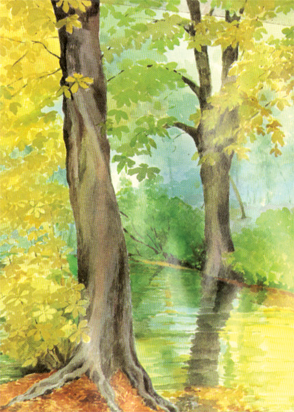
The river seems to flow
uphill |
even the calmest water is constantly moving and changing. Ripples and
eddies come and go; reflections stretch and shrink; patches of light
wink on the surface and disappear. The inexperienced artist announces on
everyone of these elusive details, like a kitten chasing butterflies and
ends up getting hopelessly confused.
Worse still, with every stroke of paint applied the painting becomes
more cluttered and what started out as a river or a lake begins to look
more like a patterned carpet. Another common error demonstrated in the
painting shown here is that of making the river seems to flow uphill!
First the angle where the river curves round the bend is too wide: it
should be much flatter and sharper. Second, there's no sense of
perspective in the ripples on the water's surface because they are all
the same size; they should become smaller, darker and closer together as
they recede into the distance in line with the laws of perspective.
Solution
The secret of painting water is to "edit out" all the superfluous
details and go for the bigger masses of tone and colour. You've probably
heard the saying, "less is more" and nowhere does this apply more
readily than in the painting of water. Achieving the smooth, glassy look
of water requires surprisingly little effort; often a few sweeping
strokes with a broad brush on damp paper are enough to convey the effect
you want. Yet beginners often seem to think that there must be more to
it than that and insist on putting in a few odd streaks and ripples here
and there for good measure.
Be decisive whether you apply your colours to dry or damp paper is a
matter of preference, but here's one important piece of advice: choose
your colours with care and apply them with confidence. The more
decisively and simply you paint water the wetter it looks, so try to
work with large brushes that discourage the habit of fiddling and
prodding and use plenty of water to facilitate smooth, even strokes.
Mix your colours carefully on the palette and test them on scrap
paper before committing yourself, remembering that they should appear
quite dark in tone to allow for the fact that they will fade a lot on
drying. |


")