Using various effects in watercolour
by Tissa Hewavitarane
The difference between a photograph and a painting is that a painting
expresses more than just the surface appearance of things with each
stroke of the brush, the artist expresses his own personality and
feelings about the subject.
This applies particularly in a watercolour painting in which every
brushstroke remains visible and therefore becomes an integral part of
the finish image.
Beginners though have a tendency to be rigid and flexible in their
brushwork because they lack the confidence to be able to let go and
adapt to the spontaneous qualities of watercolour. A watercolour must
always be painted from light to dark.
 Painting in watercolour needs a high degree of planning and
forethought. Because watercolours are transparent you can't paint a
light colour over a dark one as the dark colour will show through. Painting in watercolour needs a high degree of planning and
forethought. Because watercolours are transparent you can't paint a
light colour over a dark one as the dark colour will show through.
Expressive brushwork
This means you have to know in advance which areas of the picture are
going to be light and which are going to be dark and be prepared to work
methodically from light to dark.
Various effects can be achieved with a dry brush. A dry brush stroke
on a dry background brings out the grain of the paper and can create an
interplay with previously applied coats of paint. A dry brush can be
used to paint over a white surface or one previously tinted with a wash.
The technique of using a dry brush is one of the most interesting
ones that can be performed with watercolour.
It isn't something to be used at all times, since some areas of a
painting will inevitably demand techniques involving blending colours or
creating gradations.
Light values
This pattern of values is well suited for landscape painting. The
sky, for example, the source of light, is very light in value. All
horizontal planes, since they are perpendicular to the source of light,
are also very light in value.
All planes that are paralel to the light source and are middle values
and dark values.
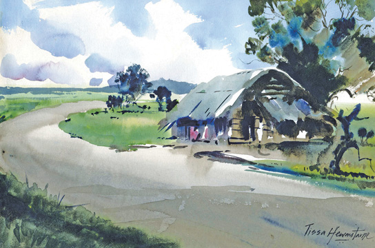
Take the landscape painting I have done here. The painting depicts a
village scene done on a bright sunny day. The main object of interest
should never be the exact centre of your painting, move it to the left
or right.
You will notice the focal point is the main object which is the hut
just placed off centre. A focal point on a painting is liable to look
monotonous. So compliment it with plenty of varieties. Observe what I
have introduced to make alive painting.
Observe what I have introduced to make alive the painting: the huge
tree in front of the hut, the road taking a bend and human figures
seated inside the hut in silhouette.
Depth
Human figures can make a landscape full of life and gives depth to a
picture. The tree is massed into groups of light and dark tones, so that
each colour strongly registers against the other. Warm and cool greens
built up with transparent glazes give the effect of sunshine through the
leaves.
Notice the clouds on a sunny day. There's a lot of light around and
blue-violet rays are often reflected. Variety causes the composition to
be alive, help from being monotonous.
Don't allow any part of the painting to become dull because of lack
of variety. Nature can always change and we as painters must observe and
paint each colour and value carefully and accordingly.
The earth depends on the value and colours of the sky. A successful
painting of nature's vista depends on our knowledge and the role of the
sky plays in this spectacular drama. We must always be aware of the
effect that light has on our painting. Harmonious colour and tones give
clarity and strength to the image.
Shadows
Shadows are a marvellous device for conveying an impression of bright
sunshine. Here the pattern on shadows cast by the huge tree on the
roadside activates the composition and creates a spring-like feel.
The area corresponding to the road is minimally but clearly outlined.
Care is taken to draw the curve that diffentiates the road from the
earth and its patch of grassyland. A light mixture of burnt amber is
used to show the shadow fallen on the road. Shadows can be used to help
build or strengthen a composition.
The best way to describe a bright sunny day is strong value contrast.
My intention was to first express the quality of strong light using
pure, clear, transparent pigments thus increasing the impression of
light and luminosity. Remember that colour is an equal and essential
partner when portraying light.
It is not enough to squint your eyes and see only values. You must
look into the shadows and identify the colours that are there.
Do not look for formula or shortcuts to tell you what colours and
shadows should be. Look for the warm to the shade and cools in the
sunlight.
Contours
Shadows are always useful in indicating form and texture of surfaces.
The best way to put in a shadow is to first observe very carefully where
the shadow comes from and how it changes direction as it goes over
various contours it covers.
The next thing to remember is to mix up a good shadow colour, be it
warm or cool. It's very important that you mix up enough paint before
you start, it's hopeless if you run out of colour halfway through
shadow.
You should gauge how much colour should be mixed with water into your
palette to paint exactly shadow falls. First try out for strength on a
piece of scrap paper and work quickly and decisively.
Nothing looks worse than an opaque or over work shadow. If it has
been left transparent, it will then show the other various colours
through it as it crosses say a cream path or a green lawn. Train your
eye to search out these things. The more you practise the more exciting
subtleties you'll find.
|


")
