|
[Learn to draw]
By Tissa Hewavitarane
Aerial perspective in painting
In landscape painting, however, perspective is less of a problem than
it is, for instance, in drawing buildings. There is less need to worry
about linear perspective, rather than the need to concentrate on aerial
perspective. This is one of the useful techniques in watercolour and
gives tonal values which create the illusion of space and depth better
than anything else. It is based on basic principle in nature that light
tones seems to reduce into distance whereas darker tones seems to come
forward.
The next important thing to realise about recession is that objects
also appear to contain more blue the further distant they get. You will
notice the painting here shows the greens in grass and trees, for
example, are quite pale and bluey at two miles away and they get richer
and warmer as they get nearer to the viewer.
One would be surprised how many art students seem to be unaware of it
or, at any rate, forget it as soon as they start painting. They see what
is obviously a dark tree on the horizon about ten fields away. They
paint it in a strong dark tone, forgetting that there are still about
five layers of trees before the foreground is reached. In other words
they have used up their tonal 'big guns' in the background and have
nothing more powerful left for the foreground.
 |
|
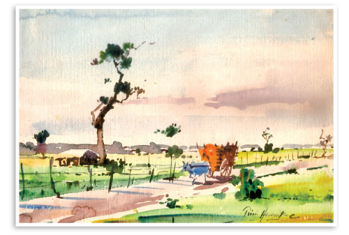
This painting demonstrates the effects of
an aerial perspective |
The same applies if too rich a green is used for a far distant field
which should have been held in reserve for a nearer one. I suggest any
student to paint from the furthest distance, gradually moving forward in
planes to the foreground.
Counterchange
Counterchange is the placing of dark shapes against light ones, and
light shapes against dark. Basically this contrasting areas of dark and
light as one on the chess board. This principle should be, locked in
your mind all the time when you are painting, almost like a fighter
waiting for the opportunity to use his favourite punch. All the great
masters used this principle when they composed their work.
One would only realise how important it is when you see a painting
done by some one who hasn't yet learnt about counterchange. A house may
be put next to a tree, both with the same tone, even though they may be
different colour, and the only way can be separated is by having to draw
a line on top to show the edges which is correct. What they should be
doing, instinctively is to darken the tree to show up the edge of the
house or darken that bit of the house where it comes in front of the
tree.
These things do not just happen by accident in a painting, they have
to be thought of before hand. I have painted a simple landscape here
with trees to demonstrate the effects of an aerial perspective. In the
distance, the trees are small, a flat cool green is applied with no
detail.
In the middle ground I have added green with a mixture of light wash
of burnt sienna and have painted the trees and bushes in two values,
light and dark. By using an aerial perspective, I have created an
illusion of depth and space on my paper. The colours I have used in this
painting are lemon green, with a layer of transparent glaze over the
foreground to brighten it. |


")


