|
Art 101
Creating magic with water
by Tissa Hewavitarana
It seems improbable that water-colours are often made with very
little water. But this is so. Washes should be prepared in containers
that will hold plenty of water. Painted washes are continuous areas of
water that take more than a single brush stroke to apply. Succeeding
strokes (of either colour or water) should be made at the wet edges to
spread the colour area. All must be done rapidly to keep the tones of
the wash even.
|
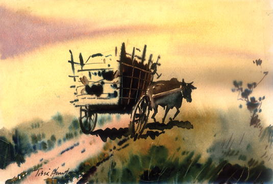
A scene showing movement and action, a typical wash drawing. |
Some drawing papers help this process while others hinder it. Colour
and value changes can be made while applying washes, but try not to
scrub or overwork a good wash - it will just be destroyed. Applying a
loaded brush to paper is a delightful experience and should be
experienced for itself. Jumping directly into wet water colour can often
produce (1) fear, (2) a feeling of helplessness or (3) a reverting to
grade school practices. Several days or longer working hours with wash
drawing stressing value contrasts and wet-in-wet techniques, is often
valuable in overcoming these problems. Line can be included in the
process, or not but the use of limited values of wash tends to create
the correct attitude toward the transparent application of colour. Still
lifes or student models make excellent subject matter for such drawings
and for later watercolours. Keep the values limited to three and plus
dark colour and work from lightest areas to darkest. Always notice the
effect of wet into-wet areas, wet over dry white space left untouched
and contrast obtained by over lapping washes. Keep working quickly and
loosely to establish a painterly quality. Explore methods of simulating
textures by spattering or allowing drips to run their course. Keep
painting sessions relatively free of restrictions so that experiments
can be done and discoveries can be made.
Succeeding steps might involve the introduction of one or to colours,
while keeping the subject matter and work methods the same. Keep the
first palettes limited in colour and stress transparency, overlapping
and textural effects. Apply colour washes over three-value ink wash
drawings. Substitute watercolour for the washes and work in the same
manner.
Movement and action
Look at the painting I have done here. It moves but different, yet it
share one common factor it shows dynamic action. It is differ from still
life or most landscape painting and the difference was created on
purpose. I have introduced a bullock cart with loaded items, the bull
pulling up hill on a rugged road. To produce a feeling of real movement
in the picture several things can be done. The technique of applying the
paint can show movement in vibrating colours with rhythm. You will
observe rapid and excited stroking of the brush can create movement.
Study the colour washes done, they are wet, vibrant spontaneous and
juicy in varying degrees.
Some are more controlled than others, but all are done with large
loaded brushes. You will observe there is no detail in the drawing but
bold brush strokes are introduced with darker areas wash in all sky and
large shapes, negative and positive. Darker areas are added next working
from light to dark. Notice now shadows fall and stroke darker washes
over these darker value areas which tend to pull the painting together
and produce a more unified result.
Do not overwork the surface, don't add too many details. Don't scrub
and don't apply too many washes over each other or muddiness will
result. All the don'ts seem to apply to doing too much of something to
the painting. Watercolours generally work best when kept simple, and
easy rule to remember is just 'keep simple'.
Easiest to apply are washes that can be laid on from top to bottom.
By adding and stirring in more colour (or another colour as the wash
progresses, it can be graded to dark or to another colour. By adding
water with each stroke, the wash will be graded lighter. With practice
you can learn to control the phenomenon. A small amount of paint can be
placed on the pallette. Water colour paint from the tube is denser and
more concentrated than solid colours, which are wetted and softened by
running the brush back and forth across the paper. Once the colour is on
the pallette, the water is added with brush.
The more water you add the more transparent the tone then appears.
Moistering the paper before your apply colour is the best way to excute
gradation. Paint is applied where the gradation begins. Since the paper
is wet, the colour will spread much more easily.
The more you extend the paint, the more transparent the colour
becomes. With a clean brush you wet the area where you want to paint the
gradation in this way, the colour seeps into the wet area, since wet
paper allows the paint to spread on its own.
It's a great way to get your feet wet in the medium, and to
experience a sensation unique to transparent water colour. |


")
