|
Painting 101
How to make wise colour decisions
by Tissa Hewavitarane
I certainly do not suppose it is possible to cover the scope of
colour in a single article or even in a one-thousand-page book. What I
intend to do is to share some ideas that will provide a foundation on
which you can build a more rational, as well as expressive approach to
colour decisions.
At the most basic level, colour is not complicated. Two colours are
placed side by side in a painting. You have the choice of either making
them different in a limited number of ways, or keeping them similar.
There are certainly times when one choice is better than the other.
Poor colour relationships happen when the artists do not consider the
choices. Unfortunate are the painters who paint exclusively in local
colour.
 They
see the sky as blue, the grass as green, the house as white and the farm
as led. I use the word ‘see’ incorrectly for they don’t see any thing.
Rather, they go to their memory bank of colour generalisation and select
a colour that was stored away as toddlers. They
see the sky as blue, the grass as green, the house as white and the farm
as led. I use the word ‘see’ incorrectly for they don’t see any thing.
Rather, they go to their memory bank of colour generalisation and select
a colour that was stored away as toddlers.
Old habits
It’s hard to break old habits. To improve your ability to see colours
correctly, never begin by asking the question, ‘what colour is it’. The
answer will be one-word generalisation too narrow to be of any value.
First determine what value it is somewhere between white and black. Then
decide what temperature it is warm or cool.
Next, ask what the intensity is somewhere on the scale from pase,
intensive colour is neutral grey. Having once, with sensitivity and
intelligence, identify the colour of a shape and place it on the paper,
a series of decisions is set in motion. You will want to place a colour
next to the first which will enhance both. Keep in mind that contrasts
are complementary.
As dark values make an adjacent light appear lighter, so also do warm
elements its opposite. Your choices are limited to value, intensity,
temperature or various changes.
As arrangement of shapes is essential to a great painting, once you
have designed these shapes and drawn them on the page, the next
requirement is that you make them visible.
Nature’s colours
One approach to making the shapes and patterns of our painting
visibly clear is separating them by value contrast. When you do so
colour takes a secondary role. You need only identify what value to make
a shape. Forget the local colour and establish the value contrasts that
will make the shapes and composition clear.
It isn’t necessary to use colour to paint, we compose with graphite
all the time. Since nature’s colours tend to be warm and neutral, the
palette is effective.
It would not work if the goal was to express the brilliant colours of
a flower market. Value painters paint and observe with their eyes
squinted. They can generally be recognised by the presence of crow’s
feet extending back to their ears.
The impact of value painter’s work is in the contrast of values and
texture. The best of the value painters do not pretend to be colourises.
They avoid strong colour that compromises the effect of value contrast.
A declaration of intent is important to your artistic development.
Categories
Water colours generally fall into two categories glazers and mingles.
Glazers work in sequential layers of pigments. This can be done in using
a wet-over-dry technique. Mingles are generally less patient and prefer
to mingle pigments of change colours along a wet edge. Many of the
colours achieved in our paintings are the result of not pigments used,
but also when and how they’re applied.
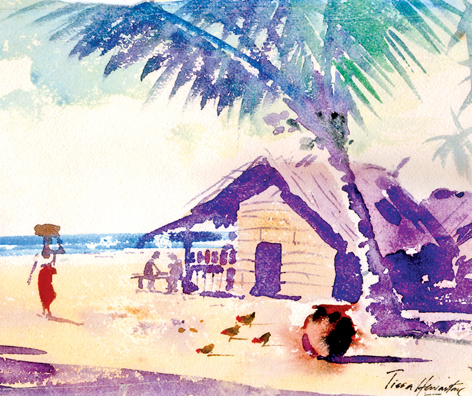
The painting shown here is based on applying several colours. The
whole painting is at the bottom. The eye travels to the foreground
objects which are the nuts and the coconut trees and into the main part
of the painting travels around from object to object.
In a landscape the eye is always drawn to human figures. The two men
seated at the corner of the hut playing a game of chess form the
anchoring point for the whole composition.
The technical richness of this medium is such that one of the most
interesting techniques that it has is precisely the opening up of white
spaces. Notice the white spaces left on the trunk of the coconut tree,
the women’s jacket and the sky.
To give more life to the painting, I have introduced a few cock birds
picking up food. You will observe that the entire painting is done by
brush without using the pencil.
This need lot of experience, patience and hard work, and
concentrating of mind where to put the correct colours at the correct
time. Keep this balance of constant practice within a framework of
understanding which is the key success to a brilliant painting.
The painting illustrated in this article is based on light caught in
one instance before it moved on.
The real challenge of light is that it is always moving and what I
try to show is the light moving around and changing as the sun goes
lower in the sky. The material used is kent paper 150 gsm with 80f sabel
hair brushes Nos 1,2,6, and 12.
www.tissahewavitarane.com
|


