Painting 101:
Painting light and shadow
by Tissa Hewavitarane
I consider light as something created by the sun illuminating the
earth's surface. Therefore, we as artists need light to paint. Light
comes in many forms. Light has colour and differing intensities; it can
be direct or reflected; it can define local colour, obscure and alter
local colour.
|
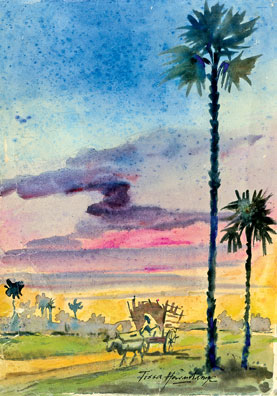
The sky takes on a radiant glow at the close of the day. |
Becoming acutely aware of specific lighting conditions can make you a
better painter. We are out in that glorious light of the world where we
experience nature in all its moods from early morning until the hour
when only man made light is left. Depending on the nature of the day,
reflected light can be either a very important part of your painting.
Seeing the pattern of shade
The most dramatic and instructive to the idea of 'designing with
light' is to begin by exaggerating the contrast of light and shade.
Seeing the shape of shade is not as easy as it sounds. Several hurdles
must be cleared before patterns of shade can be accurately observed and
subsequently useful when painting.
The first is to disengage the brain. This is not something I suggest
you do to excess, but it is helpful when the objective is to observe
clearly. The brain has too many options as to what you should see and
often overrides what your eyes actually see.
The second hurdle is to disregard local colour and surfaces that
absorb light making it difficult to observe light. The perception of
colour is directly related to the reflection of light waves. Dark
surfaces absorb much more light than do light surfaces, which makes it
hard to see them. On the other hand, shiny surfaces can fool you because
they reflect values from other surfaces. Water often appears dark when
reflecting shaded surfaces even though it is in direct light. The beauty
of seeing the patterns of light and shade is the compositional
possibilities provided. There will be times when you elect to ignore the
effect of light on a colour, times when it is compositionally
advantageous to paint the sun lit-roof black and times when it is best
to paint the black roof light. The point is, you do have the choice.
New goals
Great painters are the result of great shapes and great colour
arranged in an honest and expressive way. Designing with light lets you
create beautiful shapes by simplifying complex subjects into patterns.
The last hurdle is to shake off some of the erroneous concepts which
stand the way of this goal. To improve your paintings throw off the old
concepts and dedicate yourself to new goals. Ask yourself how many
subjects can be joined into a generous shape.
Design your painting with three or four shapes rather than ten or
twelve. Paint at arm's length and spend as much time and looking at your
decision as you apply paint.
Certain decisions have to be made even before you start to paint. For
example, what kind of day is it?
Where is the sun? Is it high or low? Each shift in position changes
the character of the subject. That is why water colourists learn to work
quickly outdoors. The light determines the quality of the edges, the
vibrancy of the colour and the contrast between values is the key of the
picture. You have to determine your theme, the kind of mass and line
that corresponds to them and even the paper that best fits the
particular subject. The danger in water-colour is when you only
half-know and then try to correct while you paint. Know first and the
medium will work for you.
When I start painting, my real subject is the quiet mood of the day.
I paint what I feel, not just what I see. I first paint the warm sky
preparing the area by wetting it. The wet paper gives a better control
of the wash. The sky colour reflects down on the upright planes. This
makes more sense. I enjoy the old water-colour practice of unifying a
picture by throwing a lot of earth colour into the heavens.
Importance
Always remember that the values are what make the painting's shapes.
The values are of great importance and one of the first things to be
considered. After we have the value then we may add colour to it.
Generally, water colourists start by putting down light values and
work through middle values to the darkest, simply because working over
previous areas makes them darker. Value contrasts are one of the major
factors in the sparkling quality of watercolours. The dark makes the
light shine and the light makes the dark seem deeper. Light values can
be tied together in a painting and so can dark values.
Variety
As we have seen nature's colours are full of variety, but how can we
get the feeling into our paintings? It's only by working and
experimenting with colour in an effort to get a perfectly graded wash.
Anything to vary the wash and give it the look that an artist thinks
more accurately suggests colour, atmosphere and light.
Light is the life of the painting. And to guarantee bright luminous
lights the washes should be lively, bright and spontaneous and unworked,
lighter and brighter. It is also difficult technically to do everything
in one wash. You cannot control your edges. Working in a series of
washes also gives you better control of your colour.
Study the painting shown here. The appeal of the painting lies in the
delicate transition from pale delicate washes to strong dark colours.
To get more expressive power into your painting its vital to put more
energy into your brush strokes. Achieving this energy without losing
control of the medium requires skill and this can only be gained through
constant practice.
www.tissahewavitarane.com
|