|
Painting 101:
Create impact with colour
by Tissa Hewavitarane
Your ability with colour increases as you become more intimate with
your subject. Select all of your colours with affection! Choose colours
because of the way you feel about what one colour does when it’s mixed
with another. For instance, if I feel that a colour is too raw, I’ll
tone it down with raw umber. Put impact in your design with colour. Use
mauve and burnt sienna to create deep colours on the buildings right up
in the fore ground. Touches of ultramarine blue are in those strong
clean shadows.
For the building in the background, lay in a wet wash of mostly
Davy’s gray,with more raw umber and ultramarine blue, and let it get
weaker as it recedes. Increase the power of your colours by contrasting
the Davy’s grey with a touch of permanent rose and cendre blue in your
sky patches, and sensitive pale colours.
|
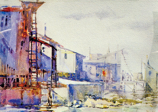
Changing values and colours on the buildings enhance the
quality of the painting. |
There are touches of vividian in the deepest values of the middle
building and in the pier base of water reflections. Feel free using your
colours, within the framework of this strong pattern, but relate each
colour carefully to its neighbour just as musical tones are related to
achieve harmony.
Making your choices work
Choose the best angle from which to paint your subject. Modify the
shapes you see in nature and try to improve them as you paint. Make each
segment relate to its adjoining shape. Be sensitive to the light. If you
are looking for material and you find an excellent subject, a house or a
hill, think out your colour changes as you draw, and make a note of them
in the margin of your sketch. Keep the feeling of the hilltop, even
though you’re now up on the ridge.
Colour relationships
As the most basic level, colour is not complicated. Two colours are
placed side by side in a painting. You have the choice either making
them different, in a limited number of ways, or of keeping them similar.
There are certainly times when one choice is better than the other. Poor
colour relationships happen when the painter doesn’t consider the
choices. To improve your ability to see colours correctly, I suggest you
try this agenda. Never begin asking the question “What colour is it?”
The answer will be a one-word generalization – too narrow in scope to
be of value. First determine what value it is – some what between white
and black. Then determine what temperature it is either warm or cool.
Third, ask what the intensity is somewhere on the scale from pure,
intense colour to natural grey. The last question, which you probably
would have answered by this time is, ‘What colour is it?”
Instead of saying the tree is green, your response will be, the tree
is dark, warm natural green. You might also answer light, cool, pure
green. This approach arms you with much more specific information.
Keep in mind the contrasts are complementary. As dark values make an
adjacent light appear lighter, so also a warm complements a cool, a pure
complements a neutral, and any hue complements its opposite. Your
choices are limited to value, intensity, temperature, or hue changes.
When value wins, colour loses.
This is not to say the colour of choices are not important. Value
paintings should have beautiful colour, but this painting’s shapes are
visible because of their light values against dark values.
Light next to dark
An arrangement of great shapes is essential to great paintings. Once
you have designed these great shapes and drawn them on paper the next
requirement is that you make them visible. I know this sounds obvious,
but believe me, it’s not. I have seen hundreds of paintings in which
contrast of values, colours and textures have been reduced to an
indistinguishable mush.
It is not necessary to speak loudly, but it is essential to speak
clearly. One approach to making the shapes and patterns of our paintings
visibly clear is separating them by value contrast. When you do so
colour takes a secondary role. You need only identify what value to make
a shape. Forget the local colour and establish the value contrasts that
will make the shapes and composition clear.
Value
Value painters tend to be representational painters. Their concerns
are how light and atmosphere affect the value and colour of objects in
space. The study of these observations is called aerial perspective.
While aerial perspective is not a science, it comes close to science,
because the results of light on objects and on the landscapes are
observable. These results do not call for interpretation or subjective
reasoning. Objects that recede into the atmosphere appear lighter in
value, cooler in temperature, and lose their texture definition.
All you have to do is remember a few simple rules, apply them to some
interesting shapes and success is yours. In the hands of the best and
most experienced painters, the results of values and aerial perspective
can be magical. If it’s your intent to make a painting with an emphasis
on colour and you fail to reduce, value and pattern contrast, you will
produce a painting that is not about colour at all. It will be a
painting in which value and pattern have stolen the show, leaving colour
in a supporting role. For if you don’t decide and do a painting in which
there is equal contrast of colour, value and pattern, the result will be
in which each contrast neutralizes the others. Great painters understand
this and that is why they are great painters. Andrew Wyeth is a value
painter. His paintings have reduced colour and pattern contrasts. John
Martin’s work emphasizes pattern and has minimal contrasts of value and
colour. Vincent van Gogh and Paul Gaugin were in love with colour and
realized contrast of pattern and value would challenge their objective.
Points to remember:
There is a design pattern in everything you sketch. Look for it, and
put in.
Every sketch should be thought of as a plan or a structure for a
future water colour.
Your sketches reveal your initial responses to your subject. This
emotion, and each of your interpretation, will inspire future paintings.
www.tissahewavitarane.com
|