|
Painting 101:
Painting light and shadow
by Tissa Hewavitarane
I consider light as something created by the sun illuminating the
earth's atmosphere filter, and falling gently to surface. Therefore we
as artists need light to paint.
Light comes in many forms. Light has colour and differing
intensities; it can be direct or reflected it can define local colour,
obscure and alter local colour. Becoming acutely aware of specific
lighting conditions can make you a better painter.
We are out in that glorious light of the world where we experience
nature in all its moods from early morning until when only man-made
light is left.
|

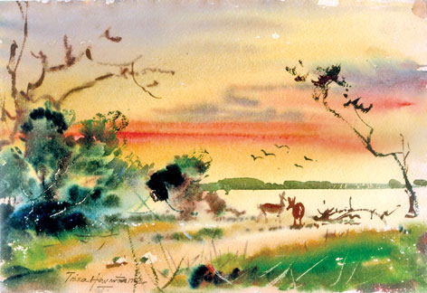
Evening shadows |
Depending on the nature of the day, reflected light can be a very
important part of your painting.
See in pattern of shade
The most dramatic and instructive approach to the idea of 'designing
with light' is to begin by exaggerating the contrast of light and shade.
Seeing the shape of shade is not as easy as it sounds. Several hurdles
must be cleared before patterns of shade can be accurately observed and
subsequently be useful when painting. The first is disengage the brain.
This is not something I suggest you do to excess, but it is helpful
when the objective is to observe clearly. The brain has too many options
as to what you should see and often overrides what your eyes actually
see. The second hurdle is to disregard local colour and surfaces that
absorb light. The perception of colour is directly related to the
reflection of light waves.
Dark surfaces absorb much more light than do light surfaces, which
make it hard to see them as light-struck surfaces such as roof shingles,
grass, foliage and sweaters also absorb light and can look dark in
direct sunlight. On the other hand shiny surfaces can fool you because
they reflect values from other surfaces.
Water often appears dark when reflecting shaded surfaces even in
direct light. The beauty of seeing the patterns of light and shade is
the compositional possibilities provided. There will be times when you
elect to ignore the effect of light on a colour, times when it is
compositionately advantageous to paint the sunlit roof black and times
when it is best to paint the black roof light. The point is, you do have
the choice.
How to harness the power of light
Depending on the nature of the day, the reflected light can be either
a very important part of your painting. The strong colour is the most
expressive element in the artist vocabulary. To relegate colour to a
secondary role is to communicate with half a vocabulary. Observe the
differences I have applied on this painting. I have expressed the
colours what I have felt and understood of the entire landscape. I have
titled the painting Evening shadows. You will observe a bluish yellow
light appears on the sky, with a wash of light orange. Notice the lake
with a very light yellow and earth lit with same colour.
The whole picture appears to sparkle with light and bright colour. A
grove of trees and a bush along the bank cast a very dark shadows. The
colours and the tones on the trees of a dark texture give strength and
stability to the painting. Notice how I have used rugged dry brush
strokes on trees.
The painting is also composed of grey ranging from palest tint to the
deepest grey browns and greens, giving and impression of consistent
harmonious light. One of the most attractive qualities about watercolour
is the ability to express even the most transient effects of light,
colour and atmosphere found in nature. The appeal of this painting lies
in the delicate transition from pale delicate washes to strong dark
colours. Shadows play an important role in conveying an impression of
bright light. Tones and colours are much effective in the foreground
than in the background.
To get more expressive power into your painting it's vital to put
more energy into your brush strokes. To achieve this energy without
losing control of the medium requires skill, and this can only be gained
through constant practise.
Expressive colours
To express my view on a sunset scene, the sky at sunset takes a
radiant glow. I have used subtle modulation of colour texture of tone to
create a lively impression on the whole scene. The trees give a more
rich look with two deer added to give life to the whole scenario. The
arrangement of values is very common. It's a clean clear and dramatic
presentation of any subject. Most traditional landscapes feature a light
and middle value sky against a darker shape of the land.
More contemporary examples in watercolour include fish of Joseph
Raffeel and the nudes of Charles Reid. Do not confine yourself to use
this value design to be the only and obvious choice.
If you ascertain that a dark shape would be better expressed as if
light and middle value shape, then by all means do it. The flopping of
light, middle and dark values is a fundamental part of your design
vocabulary and should be used liberally.
Transposing values is a simple procedure.
What is offered as a dark shape made of middle and dark values is
transposed into a shape in which what had been middle value is now light
and what had been dark is now middle. Just as outrageous colours
sometimes prove the best so also are the alternative value organisations.
|

