|
Learn to draw by Tissa Hewavitarane
Counterchange
Counterchange is the placing of dark shapes against light ones and
light shapes against dark. Basically, this is contrasting areas of dark
and light as on a chess board. The principle should be locked in your
mind all the time when you are painting, almost like a fighter waiting
for the opportunity to use his favourite punch. All the great masters
used this principle when they composed their work, but unless you are
aware of what is going on you probably accept it without approaching it.
|
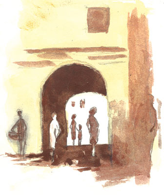
The painting depicts the silhouetted figures against the light
in the
arch and the light figure placed against the dark part. |
You only realise how important it is when you see a painting done by
someone who has not yet learnt about counterchange. A house may be put
next to a tree, both with the same tone, even though they may be a
different colour and the only way they can be separated is by having to
draw a line on top to show up the edges - it is an admission of defeat.
What they should be doing, instinctively, is to darken the tree to show
up the edge of the house or darken that bit of the house where it comes
in front of the tree.
The most obvious way of stressing the main centre of interest can be
achieved very dramatically by putting the darkest dark in the picture
against the lightest light, such as the pure white sail of yacht that
just happens to be passing in front of a very dark tree, or a bullock
cart coming over a hill being silhouetted against the lightest part of
the sky.
The same principle should be at work in a less obvious way all over
the picture, but those things do not happen by accident when painting,
they have to be thought beforehand.
Let me emphasise this again, put the idea of counterchange into your
brain permanently and use it at all times as part of your armoury. With
this in mind you can even begin to see new patterns in nature itself,
where so often in a landscape objects seem to be set one against the
other in sharp tonal contrast.
If nature does not always do it for you, rearrange the adjacent tones
yourself. It is up to you, after all, you are in charge. Notice the
silhouetted figures against the light in the arch and the light figure
placed against the dark part painted by me.
The drawing paper to be used is Kent or Whatman 180 gsm and brushes
sable hair No. 2, 5 and 6. No. 6 brush is used to colour the dark part.
I have used only two colours a light wash of yellow orchore and a thick
layer of burnt sienna applied for dark shading. |


")
