Combining all the techniques
by Tissa Hewavitarane
We have looked at basic watercolour techniques of wash, wet-into wet,
dry brush and calligraphy in the previous articles. They all have their
strengths and weaknesses. Wash, for example, is the most positive way of
indicating shapes. Its strength lies in its simplicity, but it can get a
bit monotonous.
|
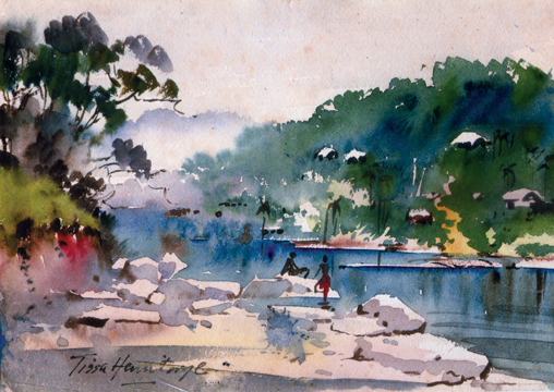
A painting done using the wet-into-wet technique. |
Wet-into-wet is the most spontaneous and exciting, but too much of it
can be vague, and look like candy floss. However, wet-into-wet is a bit
of a misnomer because if you do actually drop wet paint on to wet
surface you then get two lots of water and the result it weak, runny and
out of control.
Experiment
Apart from describing the main pit falls, there is no way one can
really explain the technique. You just have to experience it and
experiment yourself. Try it out with just one colour first, say burnt
amber and be prepared to waste a few sheets of drawing paper. Let
yourself go fearlessly, do not be timid.
Always have the painting on a gentle slope and use gravity, to help
you, which can be rather like swimming with the current. It's so much
less effort and you'll need less strokes.
The technique is ideal for doing such things as cloudy skies, mists,
trees and surging surf, but do not attempt to do the whole painting in
wet-in-wet, it will just look out of focus.
It's much more effective when the soft edges are contrasted with
sharp-edged areas and calligraphy applied after the paper has dried or
almost dried. When running colours on to a saturated paper, be sure they
are quite intense, since they will dry lighter.
Remember that the water in the paper dilutes the colour as if flows
from the brush, so the fresh colour needs to be put on relatively dry
paper if it is to stay in place. No verbal explanation can tell how it
is the process. Must be experienced.
The wet paper is usually worked on while flat, because a slanted
surface will cause colours to run towards the bottom of the sheet. This
could be desirable in some cases. Rough or textured papers generally
work better than smooth.
A word of warning is needed here. Never use wet-into-wet for
foregrounds, they at least, should be crisp and sharp, otherwise it will
look as if you are wearing the wrong glasses.
Rich colours
Looking through my own painting, I find that wet-into-wet techniques
have formed an important part in most of them, perhaps because they
always seem to sell (It's what most people think of watercolours) but
mainly just because I really enjoy doing it so much.
The stream here is a good example of the use of wet-into-wet,
reproduced. I used quite a strong paint to get the dark trees at the far
end showing the use of strong thick paint on a damp surface. The
contrasting bank on the left corner and the bank on the background is
given a light wash. The stream was then painted over with clear water
and the dark reflections dropped in.
You will observe the small huts at the distance give a depth to the
whole picture. Notice the sky a uniform blue all over. Due to effects of
atmospheric perspective it normally appears bright and warm directly
overhead becoming increasingly cooler, showing how clouds too obey the
laws of perspective, appearing to get smaller as they reach the horizon.
It's a typical wet-into-wet painting with sharp touches added for
contrast.
Dry brush technique
The first thing to say about dry brush technique is not to over do
it. It's very useful to produce textures, and to suggest detail. The
paint is put on with the brush quickly skimming over the surface of the
paper, leaving the colour on the ridges of the irregular surface. Dry
brush techniques are generally used on rough paper, allowing the
textures surface to do much of the work.
Load a flat brush with watercolour and squeeze most of it out into
the palette. Blot the brush on the paper towelling or other paper and
stroke it lightly across the work. The surface texture will grab some of
the colour leaving a pebble trail that reflects the paper's surface with
white flecks shimmering through the colour.
Dry brush passages can be put on clear white paper or a dried wash.
Washes can be flooded over the dry brush work to fill in the white
specks or they can be left alone.
The dry brush has many uses to suggest the bright shimmer of the sun
on water, the texture of pebbles on the shore, the rough bark on a tree
trunk or the weathered surface of a plaster wall or rocks.
Your willingness to experiment with colour will yield many surprising
results, the most rewarding of which is when selecting the opposite of
the actual colour turns out to be exactly what you want to say.
Do practise these techniques although it probably won't come off at
first. In any case, it's always a good thing to have a spare piece of
paper by yourside so that you can try the effect to see if you have got
just the right amount of moisture in the brush before you put it on your
painting.
All the techniques when combined in one painting provide a whole
armoury of textural contrasts.
The combination overcomes the inherent limitation of each and they
all compliment one another.
Finally, it's rather like an orchestra with the big, bold, rich brass
contrasting at the mellow strings and clear tones of the lead
instruments to form a complete and satisfying all-over sound. |


")

