|
Painting 101 :
‘Seeing’ colour relationships
by Tissa Hewavitarane
At the most basic level, colour is not complicated. Colours are
placed side by side in a painting. You have the choice either making
them different, in a limited number of ways, or of keeping them similar.
There are certainly times when one choice is better than the other.
 |
|
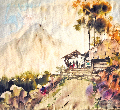
A typical wash drawing with
minimum colours. (Adam's Peak). |
Poor colour relationships happen when the painter doesn't consider
the choices. To improve your ability to see colours correctly, I suggest
you try this agenda. Never begin by asking the question “what colour is
it?”
The answer will be a one-word generalization too narrow in scope to
be of value. First determine what value it is some what between white
and black.
Then determine what temperative it is either warm or cool. Third, ask
what the intensity is some where on the scale from pure, intense colour
to neutral grey.
The last question, which you probably would have answered by this
time is “What colour is it?” Instead of saying the tree is green, your
response will be, the tree is a dark, warm neutral green. You might also
answer light, cool, pure green.
This approach arms you with much more specific information. Keep in
mind the contrasts are complementary. As dark values make an adjacent
light appear lighter, so also a warm complements a cool, a pure
complements a neutral, and any hue complements its opposite.
Choices are limited to value, intensity, temperature or hue changes.
When value wins colour loses.
This is not to say the colour of choices are not important. Value
paintings should have beautiful colour, but the painting's shapes are
visible because of their light values against dark values.
Light next to dark
An arrangement of great shapes is essential to great paintings. Once
you have designed these great shapes and drawn them on paper the next
important requirement is that you make them visible.
I know this sounds obvious, but believe me, it's not. I have seen
hundreds of paintings in which contrast of values, colours and textures
have been reduced to an indistinguishable much.
It's not necessary to speak loudly, but it is essential to speak
clearly. One approach to making the shapes and patterns of our paintings
visibly clear is separating them by value contrast. When you do so
colour takes a secondary role. You need only identify what value to make
a shape. Forget the local colour and establish the value contrasts that
will make the shapes and composition clear.
Value painters tend to be representational painters, their concerns
are now light and atmosphere affect the value and colour of objects in
space. The study of these observations is called aerial perspective.
While aerial perspective is not a science, it come close to science,
because the results of light on objects and on the landscape are
observable. These results do not call for interpretation or subjective
reasoning.
Objects that rescue into the atmosphere appear lighter in value,
cooler in temperature, and lose their texture definition. All you have
to do is remember a few simple rules, apply them to some interesting
shapes and success is yours.
In the hands of the best and most experienced painters, the results
and values and aerial perspective can be magical.
Determining contrast levels
Value refers to the lightness or darkness of a shape some where on a
scale between white and black. Some use the tone as a synonym for value.
Colour is self-explanatory. Pattern is the most nebulous tern, because
of its similarity to texture. When I refer to pattern I mean a
collection of marks (generally small in size) that, when placed
together, read as a shape.
Another definition of pattern is surface variations. After designing
the best possible shapes for a painting and deciding on their relative
sizes and positions in the painting, the next critical decision is how
to make the shapes visibly clear to those who will be looking at the
painting.
The word ‘reads’ have been coined fro this purpose. An instructor
might say, the shapes of this painting read clearly. Shape clarity is
the result of contrast of value, pattern or colour. It is important that
you remember that these three elements function independently of one
another. A shape created by value, such as a light shape surrounded by
dark, reads regardless of its colour or pattern.
The same is true of shapes created using colour or pattern. A red
shape against a different-coloured background is identifiable no matter
the pattern or value contrasts.
A busy broken-up shape played against flat, quiet shapes maintains
its identity no matter the value or colour contrasts.
It's your intent to make a painting with emphasis on colour, and you
fail to reduce value and pattern contrast, you will produce a painting
that is not about colour at all. It will be a painting in which value
and pattern have stolen the show, leaving colour in a supporting role.
Using minimum colours
In water-colour painting the most striking effects comes once using
minimum colours. Certain decisions have to be made before you start to
paint.
For example what kind of subject, what kind of day is it? Is it a
rainy day or sunny?
Each position change the character of the subject. The scene shows a
view of the Adam's peak at distance and people climbing the steps while
some taking rest at Nallathanniya the way to the peak. Observe the light
colours I have used the dark and light and the approach to wash work
technique.
Burnt sienna is diluted with water to give a light colour on the
distant mountain peak, while a slightly stronger mixture of the sky, and
trees to the right with same colour with more burnt sienna and dark
shades added.
A strong dark colour is used to show the bushes on the left and to
bring out small stone rocks with a light wash of burnt sienna and light
grey wash on the road way. On the whole it demonstrate the effect of
light on the landscape. The paper used tine grain drawing paper, brushes
nos: 2, 4 and 8 soft hair, with three colours burnt sienna and light red
and ultramarine blue used to sky. |


")


