|
Painting 101:
To turn out a good painting in watercolour
by Tissa Hewavitharana
A successful painting is made up of beautiful arrangements of values
and colour, and what helps in arranging the shapes is a knowledge of
preparations. Some areas of the painting are more important than others,
obviously, and are more pleasing to the eye. It is simply the means of
arranging the parts of your picture so that they add up to a harmonious
whole. A badly composed picture will look bitty, disjointed, and
irritating, but a well composed picture fits together in a satisfying
way.
Foreground
First, you must provide a way into the picture, usually at the
bottom, the eye is then led. Over the foreground to the main part of the
painting, resting at the centre of interest and exiting in the distance
or out of the side. Secondly, division of space is important. There are
many ways of doing this with triangular, circular, radiating and
rectangular divisions, to mention a few. The old masters were brilliant
at this and a lot can be learnt by analysing their paintings. Third,
always provide a centre of interest - the most important thing and what
picture is really all about. It is very important that this centre of
interest should be placed correctly in the picture. The most obvious way
of stressing the main centre of interest can be achieved very
dramatically by putting the darkest dark in the picture against the
lightest light.
|
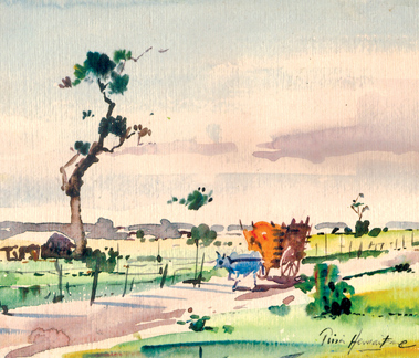
A good watercolour painting |
The main object of interest should never be placed in the middle of
the picture but set to one side. The worst part is to put two objects of
equal interest in the painting. For example, if you have to show two
boats or trees, make one bigger or more dominant than the other. You may
observe the tall tree I have done along with the small hut by the side.
You will notice that you have the power once you know how to use it, of
controlling your viewers eye. Finally, keep plenty of variety in your
painting. To give more life to the painting, I have introduced a bullock
cart with a man seated to guide the bull on the pathway. Contrast
softness and wetness with crisp, sharp strokes. Vary your textures as
much as possible; but plenty of depth in your work.
Dramatic interest
Just as a play or film often has one main character and a supporting
cast, so a picture should have one focal point - that is, one spot that
draws the eye and which carries the main theme of the painting -
supported by shapes and colours of secondary interest.
This is what gives balance and unity to the painting. Observe the
painting I have done - a countryside scene. The tall tree is the focal
point. Here the lightest and darkest tones in the painting are exposed
and viewer's eye is attracted by such a contrast. Notice the distant
trees and small huts and bushes gives a dramatic picture instead of
wearing off out of the picture. The light tone of the whole picture
attracts the viewer. The eye is always drawn to human figures and
variety of other objects and their inclusion can turn an ordinary
subject to a striking picture. The two objects, the tall tree on the
left with the hut and the bullock cart form the anchoring point for the
whole composition. The dark and light green bushes and a greenish turf
turns and create a likely impression of the whole painting.
Note how I have used rugged brush strokes to indicate the twigs and
thin branches of the tree. A light wash ultramarine blue mixed with
slight wash of yellow ochore and orange bring the foreground sky closer,
flatter and lighter in tone as they near the horizon. The horizon line
is low, which places emphasis on the sky and increases the illusion of
space. Observe the mixture of clouds, a successful painting of nature's
vista depends on our knowledge and the role of the sky plays in this
spectacular drama.
The appeal of this painting lies in the delicate transition from
strong colours to pale, delicate transition from sober colours to pale
delicate tints (soft focus) at the edges.
Learning to control water colour washes
To develop your confidence in handling paint, try working on larger
sheets of paper than you might normally use; a too small painting
surface is often the cause of tight constricted brush strokes. When you
are learning how to handle watercolour, remember the three, P's
Patience, Perseverance and Practice. You will need patience because
depending on the humidity and the type of paper you are working on.
Watercolour washes may dry more slowly or unevenly than you anticipate.
Perseverance will stand you in good stead because things inevitably
will go wrong. But after all, the capricious nature of watercolour is
part of its attraction.
If you happen to make any mistake its not the end of the world. Learn
to accept it and redo the whole painting. Because in watercolour if you
make any mistake you cannot erase as in oil by applying a white coat of
paint.
Learn not to make mistakes and move on to the next challenge.
The need to constant practice goes without saying. It's a good idea
to try out different techniques and test how they respond to each
painting. Your control of the paint can be helped or hindered by the
absorption of the paper - something you can discover only through
practice. Constant practice is the only way to get good results and if
you ever become discouraged or depressed, remember that for every
masterpiece there is a stack of discarded 'fail'.
It is through our failures that we learn and discover something new
and to be perfect.
www.tissahewavitarane.com
|


