Can you own a colour?
How would we market the shades favoured by famous artists? Following
British Petroleum's (BP) failed bid to trademark green, BBC's Fiona
Macdonald checks out the pigments of great painters.
The oil company BP lost its battle to trademark the colour green in
Australia - but other brands around the world have managed to claim
particular shades as their own: US jeweller Tiffany has the sole legal
right to use its signature blue and purple has been commandeered by pet
food company Whiskas in Australia.
From Titian red to Yves Klein blue, some shades are immediately
associated with particular artists. With the help of experts from the
National Gallery and Tate Modern in London, BBC has picked out seven
hues that have taken on particular meanings for painters in different
schools, from Renaissance Masters to Russian abstract art pioneers.
| Realgar: Titian
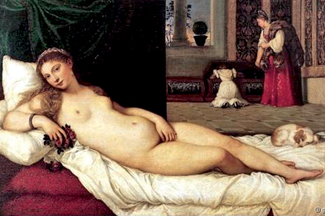 Although
artists had mixed red and yellow to make orange in Medieval
paintings, a pure pigment was sought. The mineral realgar
was used in 16th Century Venetian and Dutch flower
paintings, but it had one drawback - it contained arsenic. "Realgar
produced a really bright orange, but was poisonous," says
Campbell. Despite this, the Venetian painter Titian was
partial to the pigment, using it to tint the tresses of the
women in his paintings a particular shade that is now a
popular hair dye (and even inspired a range of Barbie
dolls). "Titian red was a phrase that was coined in the 18th
or 19th Century for looking at the hair of the women he
painted - such as the Flora in the Uffizi Gallery, or the
Venus," says Campbell. Although
artists had mixed red and yellow to make orange in Medieval
paintings, a pure pigment was sought. The mineral realgar
was used in 16th Century Venetian and Dutch flower
paintings, but it had one drawback - it contained arsenic. "Realgar
produced a really bright orange, but was poisonous," says
Campbell. Despite this, the Venetian painter Titian was
partial to the pigment, using it to tint the tresses of the
women in his paintings a particular shade that is now a
popular hair dye (and even inspired a range of Barbie
dolls). "Titian red was a phrase that was coined in the 18th
or 19th Century for looking at the hair of the women he
painted - such as the Flora in the Uffizi Gallery, or the
Venus," says Campbell. |
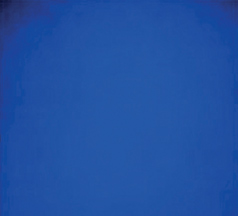 International
Klein Blue: Yves Klein International
Klein Blue: Yves Klein
While lounging on a beach with friends in
1947, a 19-year-old Yves Klein reportedly gazed up at the
sky, imagining his signature next to the clouds, and
declared "the blue sky is my first artwork." The French
artist went on to patent his own unique shade of blue in
1961 and moved away from creating the paintings himself,
instead directing naked models covered in the colour as they
walked, rolled and sprawled on blank canvases. |
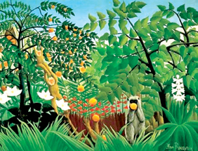 Viridian:
Henri Rousseau and Paul Cezanne Viridian:
Henri Rousseau and Paul Cezanne
What did you do if you were a 14th Century
painter, and you wanted to depict a tree? One unexpected
problem encountered by nature-loving Renaissance artists was
a degradation of pigment, leaving them with bizarrely
coloured landscapes centuries later. "Previously, painters
were often mixing blue and yellow together, and often the
yellows were unstable and so the greenery is now blue," says
Caroline Campbell, the co-curator of the exhibition Making
Colour at London's National Gallery.
"Landscapes weren't really painted until
the 16th and 17th Centuries; it's a genre of painting that
didn't exist before, so there wasn't such a desire to find
green pigments. But by the 19th Century, when Rousseau and
Cezanne are painting largely as landscapists, they have
these new manufactured pigments that are rich in colour and
also very stable: emerald green and viridian. Suddenly you
have these landscapes which can be green, and stay green."
|
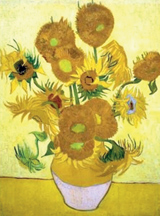 Chrome
yellow: Vincent Van Gogh Chrome
yellow: Vincent Van Gogh
"People associate yellow with Van Gogh,"
says Campbell. "He said that yellow is the colour of
happiness ... and it's the colour of so many of his
paintings between 1880 and 1890." Doctors believed that the
Dutch painter suffered from epilepsy, prescribing him the
drug digitalis - which can cause users to see in yellow.
High doses of the chemical thujone can have a similar
effect: the toxin is present in absinthe, which Van Gogh
drank regularly. "At this really intense period in the
summer of 1888 when he's painting the sunflowers, yellow
really is the colour of happiness," says Campbell. "But that
changes, and by the end of the year when he's cut off his
ear and his relationship with Gauguin is gone, it's
interesting that his self-portrait with a bandaged ear is
also in yellow. Maybe it's because he's thinking about a
moment in his life in which he was very happy." |
| Black: Kasimir Malevich
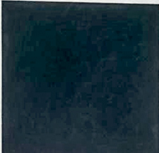 Renaissance
painters produced their blacks by burning bones or ivory,
collecting soot from oil lamps and grinding charred grape
vines. The colour was long associated with death - but one
painter gave it a different spin in 1915. When Kasimir
Malevich painted his first Black Square, he launched a new
movement, Suprematism, and liberated art from the
figurative. Renaissance
painters produced their blacks by burning bones or ivory,
collecting soot from oil lamps and grinding charred grape
vines. The colour was long associated with death - but one
painter gave it a different spin in 1915. When Kasimir
Malevich painted his first Black Square, he launched a new
movement, Suprematism, and liberated art from the
figurative.
It "brought an end to centuries of
representation and marked a zero hour in modern art"
according to Achim Borchardt-Hume, the curator of Malevich:
Revolutionary of Russian Art at London's Tate Modern. It
also became a personal motif for the painter: when he died
in the Soviet Union in 1935, mourners waved banners with
black squares; his burial site was marked by a black square
on a white cube. "Within months of Malevich's death, his art
was banned from public view and the Black Square was not to
find its way back onto display until the early 1980s." But
the dark hue marked a new beginning: "For Malevich, it was
the starting point for a wholly new approach to art, wiping
clean the slate of conventional notions of image
construction." |
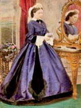 Mauveine:
Royal portraitists Mauveine:
Royal portraitists
Purple, the traditional colour of royalty,
was given a twist in 1856 when the English chemist William
Perkin accidentally produced the first ever synthetic dye,
mauveine. Perkin's shade of mauve received a royal seal of
approval in 1862, when Queen Victoria appeared at the
International Exhibition wearing a silk gown dyed with
mauveine and brought the colour into vogue. In a set of
photographs, she and her family are shown in dresses in this
colour - the pictures were hand-painted with a coloured wash
made from the dye. "When I think of Victorian England, I do
think of purple as being one of the colours associated with
it," says Campbell. "Suddenly this colour that was the
colour of royalty could be really easily and quickly
produced." |
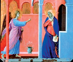 Green
earth: Renaissance Masters Green
earth: Renaissance Masters
Italian painters often used the mineral
clay pigment as an underlayer when painting skin. It
neutralised reds and pinks, which could appear fiery when
applied to wood panels - but with the passing of time it
lends an unfortunate complexion. "The problem is that often
the top paint layers faded over centuries, and now these
faces sometimes have a rather sepulchral greenish tinge,"
says Campbell. The pigment has given greenish tinges to the
faces of the Archangel Gabriel and the Virgin Mary in
Ducci's The Annunciation and to the neck of the woman in
Vermeer's Guitar Player. |
|


