|
Painting
101:
To make a floral still life more interesting
by Tissa Hewavitharane
Many problems arise in your floral painting subjects. If your
painting subject happens to be a vase of flowers now comes the moment of
truth.
|
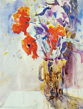
A flower arrangement with multicoloured flowers |
You are confronted with an object and a sheet of pristine white
paper. Do you panic and dive straight into the painting, hoping it will
turn out well? Or do you plan your composition calmly and rationally so
as to get the maximum impact out of your subject? All too often
compositional decisions are made without sufficient thought, and without
exploring all the creative possibilities. This applies particularly when
the subject is a simple one such as a vase of flowers. The inexperienced
artist will often go for the conventional approach and place the subject
squarely in the centre of the paper, surrounded by a plains background.
While there is nothing intrinsically wrong with this set-up, it doesn't
always make an interesting picture because it's too 'safe'.
The solution
Floral still lifes offer you exciting opportunities for creating
dynamic compositions. Don't limit yourself to approaches that are safe
and comfortable experiment with unusual viewpoints; try out different
back grounds and explore the potential colour interactions. It is the
uniqueness of your point of view that will make people take notice of
your pictures. Notice the floral arrangement how the bright red colour
of the blooms are contrasted against a simple deffective device of a
pale background, yet one which many beginners would not think of using.
Remember there is no reason a floral still life has to consist of a
single vase of flowers all on its own.
Be flexible
When planning a floral still life, make it a rule never to let your
first compositional decision be your last. Try to see beyond mere
'things' a vase of flowers resting on a table, whatever look at your
subject as a series of shapes, colours and patterns that must link
together harmoniously. These shapes, colours, and patterns are also the
words with which you will speak to the viewer, to choose and arrange
them carefully.
The flowers painted in this floral arrangement Wet-in wet mixtures of
ultra marine burnt sienna are used with bright red to create richness
and depth of colour in the shadows with the dark colour. Notice also how
the artist has chosen a vertical format for the flowers thrusting
diagonally upwards to the top edge of the paper. Observe the artist has
moved the glass jug away from the centre of the paper, thus creating a
dynamic visual tension between the subject and the surrounding white
space.
Yet, the expanse of stark white paper also provides an important
release, and balances the weight of the glass jug and flowers. Had the
artist placed the flower vase in the centre of the paper much of the
energy of the printing would have been lost.
Setting up
Try to keep the arrangement of your flowers simple and informal.
Stylised on symmetrical grouping tend to look stiff and unnatural in a
painting.
Most of us have experienced the frustration of setting out to capture
the elusive beauty of flowers only to be disappointed with our
ham-fisted attempts! Arrange the blooms so that they overlap each other,
and include profile and back views of some of them. This add variety of
shape as well as accentuating the three dimensional impression. A vase
full of multi-coloured flowers is not always a good idea, because the
colours fight each other and destroy any impression of delicacy. It's
far better to choose flowers of the same colour, or a harmonious
arrangement of closely related colours.
Mixing colours
Flowers and clarity of colours are essential in flower painting, so
you must be sure you are familiar with your colours and now they mix
together.
Flowers may be colourful, but you don't need a vast array of colours
to paint. In fact a simple palette often produces the best results,
because it is likely to be more harmonious. When choosing your colours,
avoid the more opaque one such as yellow ochore in favour of the really
transparent ones such as alizarin crimson, lemon yellow and rose dose.
When mixing colours, don't use more than two or three pigments,
otherwise the colour will turn muddy and opaque. For maximum vibrancy,
build up the forms of petals and leaves, with the glazes of warm and
cool colour that allow light to reflect off the paper. Flowers are
natural living things, and should be painted as such.
Flowers are very delicate in colouring, so try not to over work them
too much.
www.tissahewavitarane.com
|