Painting the foliage realistically
by Tissa Hewavitarane
How can I make the foliage green in my landscape to look more
realistic? The lush green of a landscape in high summer is an
inspiration to any painter.
The two most common faults made by inexperienced artists, first, the
land-scape colours have been applied straight from the tube, without any
modification. They're altogether too intense and strident not at all
like the soft greens of nature.
Second, any beginner tends to paint large areas of the picture with
one single green, without any changes in temperature, tone or texture.
This leads to a rather flat poster-like effect.
Solution
The landscape painting I have done illustrates a more subtle and
varied range of greens in the grass and foliage. Notice how the colours
change gradually from warm and intense in the foreground, while in the
distance becoming cooler. The use of colour gradation lends an
impression of depth and atmosphere to the scene.
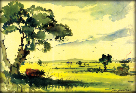 Notice too how I have introduced positive contrasts of light and dark
greens that enliven the picture and make the eye to explore the
composition. The sheer number of different shades of green found in the
grass foliage brings depth to the scene. Notice too how I have introduced positive contrasts of light and dark
greens that enliven the picture and make the eye to explore the
composition. The sheer number of different shades of green found in the
grass foliage brings depth to the scene.
Modifying greens
There are of course some splendid greens available in tubes. But
these used alone may not be enough to give you the flexibility required
to capture the subtle nuances that are found in nature's green. To
obtain livelier and more expressive colours, it's often better to vary
your tube greens by mixing them with blues, reds and orange.
It's amazing how the greens such as Vindian and Windsor green, which
are unnatural in appearance in their pure state, become much more
lifelike when mixed with other colours. The tiniest drop of Viridian,
for instance, when mixed with chrome yellow produces a luminous
transparent green that is ideal for painting sunlight foliage.
Do-it-yourself greens
Learn how to mix your own green, using yellows and blues, so that you
can vary them from light to dark, bright to muted and warm to cool. Try
making your own colours. Observe the tree trunk given a transparent
effect adding burntsienna and Prussian blue with a light wash.
I have added a cow resting under a huge tree to give life to the
picture. The greens become cooler and bluer to the distance giving an
impression of depth and space. The greens in this landscape are fresh
and vibrant because I have built the colours and tones with lively
strokes of burntsienna green, blue and yellow that create an impression
of the warm sun!
Textures
The techniques of using a dry brush is one of the most interesting
ones that can be performed with watercolours. Naturally, it isn't
something to be used at all times, since some areas of a painting will
inevitably demand techniques involving blending colours or creating
gradation.
The large tree in the foreground shown in the landscape is
sufficiently rich in shades and textures to allow it to perfectly
demonstrate the technique of using wash and drybrush. A touch of
burntsienna is also added which mixes with the green. A very light
ultramarine blue wash is applied to the sky and a darker blue is added
to give the cloud effect.
The background sky is begun with a watery ultramarine blue. The form
of the clouds are outlined, leaving them perfectly etched in the sky as
the background is completely dry. In the art below I have used a tone
that is much more transparent and bright.
Finally, to finish the study of different drying times paint yet
another overlaping range of mountains in the foreground.
As you can see with practice the exact definition of their forms can
be created but only if the background is completely dry.
I'm often asked whether I paint the foliage first and add the trunk
and branches afterwards, or paint the trunk and branches first and add
the leaves afterwards. Look at the tree first and decide which is the
more dominant.
In a full, lush summer tree it seems all foliage and you can only see
a branch or twig through the occasional skyhole. There's no point in
painting all the branches first just to cover them up - the common fault
of drawing a lot of conventional branches on top of the foliage 'just
for luck', even though they are not actually visible at all.
This really is lack of observation. During a mild summer where the
structure is dominant and the foliage light, paint the trunk and
branches first and add the leaves later.
Identity
Quite often a lot of sky can be seen through even the thickest
foliage. Putting these in also avoids that cardboard cut-out look.
Groups of trees together lose their own identity and unite to make one
shape.
The common fault here is to overdo the detail on individual trees and
forliage groups. Whenever I'm painting trees I use a soft brush to paint
leaves which forces me to eliminate fussy detail and concentrate on the
basic masses.
If you get a tree with light foliage in front of a darker tree, put
the light tree in first and then paint the darker tree round it. To sum
up then, the best way when painting foliage is to look, look and look
again.
Simplify the tones and colours, especially as they get further into
the distance. Do the absolute minimum of characteristic detail and then
stop before you overwork them. |


")


