Creating an impact with colour
by Tissa Hewavitarane
Selection of colours in a painting is dictated by the method of
working. Colour can be realistic, adhering to nature as closely as
possible, or it can be subjective, with the artist using colour he feels
is right at that time. Between these two extremes exists a wide range of
possibilities, depending on the purpose and make up of the artist. Most
inexpensive colours are rather uninteresting in themselves and need to
be mixed to get satisfying results. This knowledge only comes from
practice and experimentation with your set of colours.
Your ability with colour increases as you become more intimate with
your subject. Select all your colours with affection. Choose colours
because of the way you feel about what one colour does when it is mixed
with another. For instance, if I feel that a colour is too raw, I'll
tone it down with raw umber.
I also use a raw amber to cause a vibration, or shimmer, in a purer
hue when it's beside a brighter hue.
|
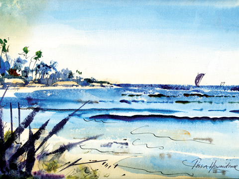
A painting done with limited colours. |
One important thing that I've realised is that most people, including
myself, work better with a limited number of colours. One soon gets to
know them intimately and to know instinctively how they react with each
other, rather like having a few true friends as opposed to too many
acquaintances.
No magic
However, there is no magic in the selection of colours. The secret is
to cut the number of colours, down to the bone and then learn to mix
instinctively, allowing the main part of your concentration to be
devoted to solving the problems of the subject in front of you, not
wondering which of your four yellows or three blues to use.
This is similar to your behaviour when driving a car – your whole
attention is devoted to the way ahead but at the first sight of danger
your foot instinctively shoots to the right pedal without any thought on
your part.
Earth colour
Let me give you my own personal choice of colours which I use, year
in and year out, whether in misty cold Bandarawela or sunny Hambantota.
They fit me like an old pair of slippers. But if you're already got
your own palette which you have learned and it suits you, don't change.
Raw sienna is one of the most important as far as I'm concerned.
I certainly use more of it than any other. It's an earth colour made
from the mineral oxides found in natural soil and is one of the older
pigment known.
Many artists have used it throughout history. I prefer it because
it's more transparent. I use it in all sorts of mixtures and I feel it
helps me to get a sort of unity in pictures.
I have got into the habit of using it very weakly as a first wash on
skies. For a clear blue sky I would brush on ultramarine at the top,
while raw sienna is still very wet, and graduate it almost to nothing at
the sky line.
The painting I have done here shows how the picture is completed with
limited colours. If you observe well, I have finished the painting with
only three colours. Ultramarine blue is used for the sea and light wash
of burnt sienna applied to the huts, green to the trees.
Of course, if you use a range of colours, mixes will be different but
the principle is the same. Learn to enjoy your correct colour mixing
rather than dreading them.
Freedom
As far as the big palette itself is concerned the whole idea is to
allow you more room to mix and move your paint around with complete
freedom, whilst still leaving plenty of virgin space for other mixes.
Some amateur artists sometimes complain that the colours run together
but that's a sign that they're using too much water and, it's the cause
of 90 percent of all the troubles of amateur artists.
Of course, you'll need plenty of water for the first washes but as
you progress through the painting you should need less and less water.
The technique of applying the paint can show movement in quivering
lines and vibrating colours or in pulsating rhythms.
Use diagonal vibrant colours, strong contrasts to get the message
across.
Guide the viewer's eye to decide where you want it to travel into the
picture. Involve the viewer right into the picture if you are painting a
street scene and leave out the figures in the street some in colour so
the eye has an alley of entry.
Pattern
There is so much pattern here, you decide to stay monochromatic and
lay in subtle value washes. In your first wash, look for some semblance
of form and selection of white pattern as you grow out of your flat
drawing. Increase your build up tone. Lay second and third colour
washes.The cool side is mauve, raw amber, and cobalt blue, the warm
side, burnt sienna and cobalt blue and mauve. Don't use bright colours,
stay with monochrome.
Now, feel your way into the few dark spots using ultra marine blue
and ivory black. Add just a touch of bright colour either cobalt green,
yellow ochore, cadmium orange and Chinese orange.Study the picture in
which light-to-dark tones are applied. Concentrate your colours as they
grow deeper using your imagination in balancing the colours.As
beginners, mainly children, should study and understand how these
colours blend when mixed together in different amounts and ensures
correct application of colours on your painting. I have used Kent paper
with a slight grain 150 grams. The brushes used No 10 and 2 and 3 sable
hair. |


")
