The art of blending
by Tissa Hewavitarane
When faced with a group of objects for a still life painting, it's
easy to choose and arrange them in a haphazard manner. The problem is we
tend to choose objects that take our fancy, without stopping to think
whether the objects will work together as a group in terms of size,
shape and colour.
Many beginners seem to dislike the idea of overlapping objects.
Everything looks steady and serious. Another common mistake in the
design of a still life is to leave too much space around the group. It
is important to compose a still life so that each individual element
contributes to the total design.
When you have a group of objects in different sizes, shape and colour,
it is vital that they relate to one another and that the spaces between
the objects also make interesting shapes.
 |
|
There is harmony and rhythm
in the objects |
Make a careful study of the arrangement of the objects before
starting to paint to see how the overall shape of the group will look on
paper. Look for points where objects can overlap, because this ties the
objects and creates an interesting shape relationship. Try to repeat the
shapes and colours within the group, because this sets up visual rhythms
which the viewer will respond to.
Repeating shapes and forms can also unite and integrate the objects
in your still life and prevent them from appearing too scattered. But
beware of making these repetitions too regular, as this can lead to
monotony.
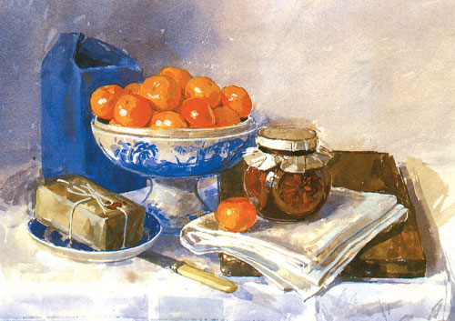
Introduce subtle variations of size, shapes or tone to add spice to
the design. Observe the still life painting shown here. There is harmony
and rhythm in the objects. Everything in the group is organised well so
as to carry the eye of the viewer on a 'visual' tour of the painting.
Every object in the group shares a common theme.
They are all kitchen objects. The colours too are nicely arranged and
tied together, with variations on the blue, orange theme repeated
throughout creating a lively yet harmonious colour scheme.
The colour, brightness, and light of the texture can all be varied
but essentially the process of valuation and modelling of the shapes is
always the same. The valuation of the oranges is done with progressive
tones of the same colour always conserving the same highlight as a
reference for the volume.
To do the valuation around the shadows, luminous green and some
orange are mixed. Still life is traditionally the pictorial genre that
generates most interest. It can be practised from the moment you start
with watercolours. |


")


