|
PAINTING 101:
Values - the dark and light of it
by Tissa Hewavitarane
Painters believe values to be the most important part of any
painting. No matter how beautiful the colours how perfectly placed the
arrangement with thoughtful proportions, if the painting is weak in
values, it will be a medicore or even poor piece of work. The values are
the skeleton of the painting on which colour and form are added. Without
good values the painting collapses.
Our world gives us so many nuances of values that they cannot be
numbered. If our painting would have all these values it would be a
jumble. A limited scale value, therefore, gives the painting strength
and validity. Every subject and every day gives us a different value
range. This is why the artist must have a very sensitive eye to observe
these subtle value ranges. It is also why it is bad to paint a scene too
slowly because light always changes.
|
The dark make the lights shine and the lights make the dark
seems deeper. |
The artist must grasp the light in the first half hour. He or she
must find the great ranges between the sky and the darks, the light mid
tones to the light and the relationship to other mid tones and to the
darks. Of greatest importance how far is the light from the dark? After
that, we can paint all day.
Values
We must try to observe all the values nature gives us and group them
together in four or five large value masses. After that, we can then
vary them a little with form and details. But always remember that the
values are what make painting’s shapes. The values are of greatest
importance and one of the first things to be considered. After we have
the value, then way may add colour to it.
If you look at the natural landscape, you will see hundreds of values
of dark and light. You can’t possibly paint them all, so do not try.
Instead simplify the values you see simply by squinting your eyes,
causing you to see only large blocks of dark and light. Generally, water
colourists start by putting light values and work through middle values
to darkest, simply because working over previous areas makes them
darker. Value contrasts are one of the major factors in the sparkling
quality of water colours. The darks make the lights shine and the lights
make the darks seem deeper.
Light values can be tied together in a painting and so can dark
values. This can be accomplished by flowing unifying washes over certain
continuous dark shapes. This keep the parts of the painting from
becoming decent realised. The values in a picture is said to be low in
key. And the darks usually create a brooding, sober dramatic feeling
just as would a piece of music similarly full of deep notes. The effect
on the viewer is usually a happy one, just like the effect of a piece of
music played in the piano’s bright upper register.
A word about washes
As we have seen, nature’s colour is full of variety but how can we
get that feeling into our painting? It’s only working and experimenting
with colour in an effort to get a perfectly graded wash. Anything to
wary to wash and give the look that an artist think more accurately
suggest colour, atmosphere and light. Mae Bennett - Brown, the fine
painter of flowers had a saying “Lighter, brighter, darker, duller.” She
meant that every time you do a wash, you dull it. The white paper is the
cleanest and brightest light of all.
The first wash sits on the surface of the paper and is very luminous.
A second wash, glazed over the first, naturally muddies and dulls the
colour. A third wash is duller still. And so on, lighter brighter,
darker, duller. Light is the life of the painting. And to guarantee
bright, luminous lights, the washes describing them should be lively
bright spontaneous and unworked. Lighter, brighter.
It is also difficult technically to do everything in one wash. You
can’t control your edges. Working in a series of washes also gives you
better control of your colour.
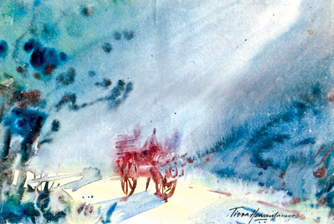
Decisions before you paint
Certain decisions have to be made even before you start to paint. For
example what kind of day is it? Where is the sun? Is it high or low? Is
it going to be a rainy day? Each shift in position changes the character
of the subject. That is why water colourists learn to work quickly
outdoors. The painting done here titled ‘Misty Morning’ will show you
the values, the dark and the light and the approach to washes work.
Mist
Mist lends itself ideally for portrayal in watercolour. There can be
few atmospheric effects more and mysterious. Mist has a distinct colour
of its own which may be a cold grey or even have a yellow tint. The
local colours of individual objects will take on some of this mist
colour. For example, when the sun is struggling to break through a
morning mist everything in the picture is in various tones of this
golden colour.
Nearly all modelling is eliminated in mist and you will mostly be
painting silhouettes, so the objects in your picture should have
interesting contours.
The painting title ‘Misty morning’ shown here emphasises the mist.
The sky was painted with a wash of cobalt blue mixed with burnt amber
and before it dried, I painted in the pearly blue greys of the
atmosphere, and gave a feeling light and the mist.
Observe how the sunlight falls to the ground. One of the most
attractive qualities about watercolour is its ability to suggest even
the most transient effects of light, colour and atmosphere found in
nature.
The appeal of this painting lies in the delicate transition of strong
colour and the man seated on the bullock-cart in the centre of the
picture to pale, delicate tints at the edges. This picture is composed
entirely of greys, ranging from the palest tint to the deepest grey
brown, giving an impression of consistent, harmonious light.
www.tissahewavitarane.com
|


")


