|
Painting 101:
How to make wise colour decisions
By Tissa Hewavitharane
I certainly do not suppose it is possible to cover the scope of
colour in a single article or even in a 1,000 page book. What I intend
to do is to share some ideas that will provide a foundation on which you
can build a more rational, as well as expressive, approach to making
colour decisions. At the most basic level, colour is not complicated.
Two colours are placed side by side in a painting. You have the choice
of either making them different in a limited number of ways, or keeping
them similar. There are certainly times when one choice is better than
the other. Poor colour relationships happen when the artist does not
consider the choices.
|
Harmonious colour and tones give clarity and strength to a
landscape |
Unfortunate are the painters who paint exclusively in local colour.
They see the sky as blue, the grass as green, the house as white and the
farm as led. I use the word 'see' incorrectly for they don't see
anything. Rather they go to their memory bank of colour generalisation
and select a colour that was stored away as toddlers.
Old habits
It's hard to break old habits. To improve your ability to see colours
correctly, never begin by asking the question, 'what colour is it'. The
answer will be one word generalisation too narrow scope to be of any
value. First determine what value it is somewhere between white and
black. Then decide what temperature it is, warm or cool. Next, ask what
the intensity is somewhere on the scale from pase, intensive colour to
neutral grey. Having once, with sensitivity and intelligence, identity
the colour of a shape and place it on the paper, a sceneries of
decisions is set in motion. You will want to place a colour next to the
first which will enhance both. Keep in mind that contrasts are
complementary. As dark values make an adjacent light appear lighter, so
also a warm elements its opposite. Your choices are limited to value,
intensity, temperature or various changes. An arrangement of shapes is
essential to a great painting. Once you have designed these shapes and
drawn them on the page, the next requirement is that you make them
visible.
Nature's colours
One approach to making the shapes and patterns of our painting
visibly clear is separating them by value contrast. When you do so,
colour takes a secondary role. You need only identify what value to make
a shape. Forget the local colour and establish the value contrasts that
will make the shapes and composition clear.
It isn't necessary to use colour to paint, we compose with graphite
all the time. Since nature's colours tend to be warm and neutral the
palette is effective. It would not work if the goal was to express the
brilliant colours of a flower market. Value painters paint and observe
with their eye squinted. They can generally be recognised by the
presence of crow's feet extending back to their ears. The impact of
value painter's work is in the contrast of values and texture. The best
of the value painters avoid strong colour that compromise the effect of
value contrast. A declaration of intent is important to your artistic
development.
Water-colours generally fall into two categories glazers and mingles.
Glazers work in sequential layers of pigments. This can be done in using
a wet-over-dry technique or dry-over-wet technique. Mingles are
generally less patient and prefer to mingle pigments or change colours
along a wet edge. Many of the colours achieved in our painting are the
result of not pigments used, but also when and how they're applied. The
painting shown above is based on applying several colours. The whole
painting process is an organised series of decisions about the next
move. This keeps the painting alive.
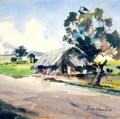
Light values
The pattern of values is well suited for landscape painting. The sky,
for example, the source of light, is very light in value. All horizontal
planes, since they are perpendicular to the source of light, are also
very light in value. Take the landscape painting I have done here. The
painting depicts a village scene done on a bright sunny day. The main
object of interest should never be the exact centre of your painting.
Move it to the left or right. You will notice the focal point is the
main object which is the hut just placed off centre. A focal point on a
painting is liable to look monotonous. So compliment it with plenty of
varieties. Note what I have introduced to make a live painting. The huge
tree behind the hut, the road taking a bend and human figures seated
inside the hut in silhouette.
Depth
Human figures can make a landscape full of life and gives depth to a
picture. The tree is massed into groups of light and dark tones, so that
each colour strongly registers against the other. Warm and cool greens
built up with transparent glazes give the effect of sunshine through the
leaves. Notice the clouds on a sunny day. There's a lot of light around
and blue-violet rays are often reflected. Variety causes the composition
to be alive, help from being monotonous. Don't allow any part of the
painting to become dull because of lack of variety. Nature can always
change and we as painters must observe and paint each colour and value
carefully and accordingly. The earth depends on value and colours of the
sky. A successful painting of nature's vista depends on our knowledge
and the role of the sky plays in this spectacular drama. We must always
be aware of the effect that light has on our painting. Harmonious colour
and tones give clarity and strength to the image.
Shadows
Shadows are a marvellous device for conveying an impression of bright
sunshine. The landscape done here shows the pattern on shadows cast by
the huge tree on the roadside activates the composition and creates a
spring-like feel. The area corresponding to the road is minimally but
clearly outlined. Care is taken to draw the curve that differentiates
the road from the earth and its patch of grassy land. A light mixture of
burnt amber is used to show the shadow fallen on the road. Shadows can
be used to help build or strengthen a composition.
www.tissahewavitarane.com |


")
