|
Painting 101:
A few typical colour mixtures in watercolour
by Tissa Hewavitharane
A selection of colours in a painting is decided by the method of
working. Colour can be realistic, adhering to nature as closely as,
possible, or it can be subjective, with the artist using colour he feels
is right at that particular time. Some books on water colour contain
entire chapters on colour - its use, mixing, combination and
applications to specific situations.
 Several aspects of colour have special interest to the water-colourist.
Water colour dries lighter and should therefore be applied a bit more
boldly than other paints. Adding this extra bit of intensity is called
'Charging' the colour. Wet a few squares and light washes into them, and
then charge with intense colour. Several aspects of colour have special interest to the water-colourist.
Water colour dries lighter and should therefore be applied a bit more
boldly than other paints. Adding this extra bit of intensity is called
'Charging' the colour. Wet a few squares and light washes into them, and
then charge with intense colour.
Mingle the colours but don't overwork them. Overlay washes often
result in fascinating colour changes.
A colour can be grayed, if it is too intense, by putting a
complementary colour over it, or by mixing the too in the palette.
Don't use black to tone down intensity. Many artists never use black
in their palette. They prefer to make darker colour which often give an
opaque look and tends to seem foreign to the rest of the colours. Most
expensive colours are rather uninteresting in themselves, and need to be
mixed to get satisfying results. This knowledge only comes from practice
and experience with your set of colours, Muddy colours result from
over-working them (too many washes) from scrubbing (using the brush too
much) or from using the more opaque colours. Such areas can be saved by
lifting some shape or line out of the area with a sponge or a stiff
brush.
Basic theory of colour
First, the question of water versus tubes. When I began painting as a
student, I bought the usual paint box with twelve colours. While I was
using small brushes it was fairly satisfactory but as I began to paint
more boldly and use larger brushes, the paint box became completely
inadequate. I couldn't get enough results from a student paint box or
rich enough mixtures when I required them. The palettes attached to
these boxes were also too small and therefore went on to tubes and a
large palette to go with them, which gave me a completely new freedom.
The next question is the difference between the very best and
expensive artists quality paints which most books insist that you buy,
and the cheaper students' quality ranges, So many people have the idea
that the cheaper quality paints would somehow fade away. Manufactures,
who of course make both ranges say that provided you kept the permanent
colours, they would both last equally long.
The main difference in the two ranges is the time taken to grind a
colour and of course some of them more expensive pigments in the
artist's quality are replaced by reliable modern substitutes. It is
important to buy from a reputed internationally known manufacturer as it
is unlikely that such a manufacturer would ruin their reputation by
selling poor quality fugitive paints.
I would like to emphasise whatsoever that I have nothing against
using artists quality colour, except for that initial inhibition which
prevents so many people from actually squeezing out enough paint.
However superb the quality it's not doing any good in the tube. If you
haven't got this problem, use artists colours by all means.
However, I do enjoy using my colours with complete abandon and
squeezing out plenty of paint, sometimes using it almost healthy on wet
paper to get exciting soft rich effects.
However, there's no magic selection of colours. Whenever I paint, the
secret is to cut the number of colours down and then learn to mix them
instinctively, allowing the main part of your concentration to be
devoted to solving the problems of the subject in front of you, and not
wondering which of your four yellows or three blues to use, this is
similar to your behaviour when driving a car - your whole attention is
devoted to the road ahead but at the first sight of danger your feet
instinctively shoot to the brake pedal without any thought on your part.
Having said that, I'm still going to give you my personal choice of
colours which I use, year in year out, whether on a rainy or misty or
sunny day.
Raw sienna
It's an earth colour made from mineral oxides found in natural soil
and is one of the oldest pigments known. Artist have used it throughout
history. It looks a bit like Yellow Ochore but I prefer it because its
more transparent. I use it in all sort of mixtures and I feel it helps
me to get a start of unity in my paintings.
Ultramarine blue
I don't stick faithfully to ultramarine blue which is a warm intense,
blue with excellent working properties and when mixed with Burnt Umber
it give a very wide range of greys by varying the proportions of each.
Burnt umber
This is a permanent earth brown, on the coll side. Again it is earth
colour. The only other colour which can be added to this brown is the
burnt sienna.
Light red
This is another earth colour and is extremely permanent. A sort of
brick red which mixes with Row Sienna to prodocea lovely terracotta for
tiles. With ultramarine it makes a subtle mavre which is excellent for
warm shadows.
Lemon yellow
This is a straight down the middle yellow, slightly on the cool side
and is again permanent.
Green
Green range from nearly blue right. Through to new yellow. There are
cool greens and warm rich greens. The first thing before you even start
to mix the paint, is learn to compare the various greens with each
other. Most artists including myself, work better with a limited number
of colours.
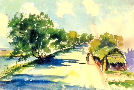
Observe the painting titled 'Shadows' which I've done with a limited
number of colours. Mainly I have used green throughout the picture.
Light and dark greens keep the eye moving back to the picture towards
the focal point - the hut. Everything the sun hits becomes, warmer and
more intense in colour, where the objects in shadow are correspondingly
cool. Note the white light reflecting on the road. The huge trees along
the road side gives life to the entire picture.
Adding figures to the picture gives more strength and valance. The
two men seated under the shady tree and a woman walking with a basket on
her head adds extra glamour to the scene. Remember in watercolour
confidence is essential and it is brought about be being in complete
control of your techniques.
|


