Landscape light in watercolour
Light is the life of a painting. Watercolour, therefore, is the ideal
medium that is fresh, alive and responsive to the moment and the
shifting moods of nature. As you have observed nature is always changing
and we as painters must study and paint each colour and value carefully
and accordingly.
|
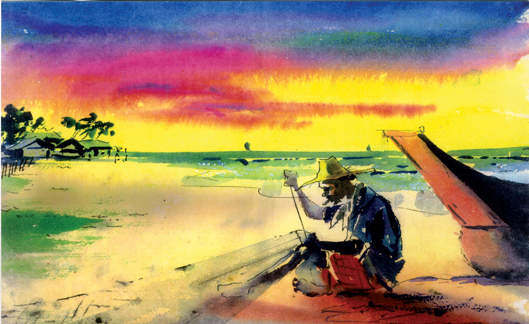
Fisherman mending the net |
The earth depends on the value and the colours of the sky. We must
always be aware of the effect that light has on our painting. Depending
on the nature of the day, reflected light can be either a very important
part of your picture. The strong light of a clear day, for example,
reflects colour into everything.
At a beach, the brilliant sun bounces light off the sand into the
surrounding darks, obliterating them.
On a very dull day, however, such effects are more subtle, the
reflected light is much harder to see.
Light and middle values
The arrangement of values is very common. It is a clean, clear and
dramatic presentation of any subject. Most traditional landscapes
feature a light and muddle value sky against a darker shape of the land.
More contemporary examples in watercolour include fish of Joseph Raffel
and the nudes of Charles Reid.
Do not confine yourself to use the value design when it appears to be
the only and obvious choice.
If you ascertain that a dark shape would be better expressed as a
light and middle value shape, then by all means do it.
The flopping of light, middle and dark values is a fundamental part
of your design vocabulary and should be used liberally.
Transposing values is a simple procedure what is offered as a dark
shape made of middle and dark values is transposed into a shape in which
what had been middle value is now light, and what had been dark is now
middle. Just as outrageous colours sometimes prove the best so also do
alternative value organisations.
Dark and light values
On the three basic value organisations offered, the option is
potentially the most dramatic and also the most difficult. Dramatic
because of the strong contrast that happens on the major subject matter.
Difficult because the strong contrast can fracture the subject into two
unrelated shapes.
When the contrast between the light value the focal point and the
middle value of the background are too close the light value and the
middle value join, and three dark shape is isolated.
In other words, the light and middle become one shape stands alone.
The same problem occurs when the dark and middle values get too close.
The critical factor is the values that surround the focal point.
Too light or too dark, and they won't work. Objects in direct strong
sunlight are frequently defined as light and dark against middle values.
An example is a white house in sunlight. The white in sunlight is
lighter than the sky, and the white in shadow is darker than the sky.
Once you decide to use this pattern, you must remain consistent.
It's easy to get confused by local colour and find yourself
vacillating between patterns at one time painting the shadow of the
darker than the sky and at other times lighter than the sky.
Expressive colour
There seems to be a belief that if a painter matches each colour
exactly as seen, reality will be the result. Nothing could be farther
from the truth.
Observe the painting I have dome titled 'fisherman mending the net'.
If you see the colour of light, which exists and only colour which
emerged is mainly yellow to express my view of a sunset scene.
The sky at sunset takes a radiant glow. Notice the colours used, the
warm pinks and golds of the setting sun with cool blues and violets of
the clouds and gradually to the stronger tones.
I have used subtle modulation of colour, texture and tone to create a
lively impression of the sea shore. The subtle details are pleasing to
the eye, but they do not detract from the focal point of the picture
which is the fisherman mending the net.
To make the picture more lively I have introduced a boat by the side
in dark tones. I felt the best way to describe the sun set was strong
value contrast. It was my intention to first express the quality of
strong light using pure, clear transparent pigments thus increasing the
impression of light and luminosity a light wash indicates the fisherman
net.
Remember colour is an equal and essential partner when portraying
light. It is not enough to squint your eyes and see only values. You
must look into the shadows and identity the colours that are there.
Don't look for formulas or short cuts to till you what colours, shadows
should be or always are.
Look for the warm colours in the shade and cools in the sunlight. It
needs some practice to allow your eyes to see shapes, values and colours.
The ability to identify actual colour is not as simple as it sounds.
The ability to correctly identify colour is to first cleanse the mind of
any preconceived notions as to what colour we have been conditioned to
see.
Skies for example, are rarely blue. Secondly, we must identify colour
in relationship to surrounding colours. Every colour we see is
reflecting into every other colour.
It is this reflection of colour that makes even opposite colours
harmonious. The flat surface on which we paint cannot reflect a colour
on to its neighbour. Therefore, it is our job to make the colour changes
necessary to achieve the same effect.
The truth of the matter is that local or actual colour is of little
value other than as a beginning point. The best paintings are not those
that match local colour to record the truth, but those that exaggerate
colour to express a truth.
|


")


