|
Learn To Draw
Tone and colour
Most watercolour painters get confused between the 'colour' and
'tone.' Tone is the lightness or darkness of an area irrespective of its
colour.
A normal landscape is composed of scores of tones ranging from white
to black. Try to simplify these into just a few. Squint your eyes until
you can only just see through them. You will then eliminate nearly all
the detail and colour leaving you free to distinguish better the various
tonal ranges.
Break down what you see into four tones, you have more or less solved
the problem. These tones extend from what in watercolour is the
unpainted paper, to the darkest pigment. The middle tone is local colour,
while highlights and shadows are at the two extremes.
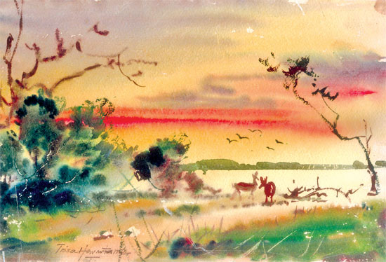 |
|
'Evening shadows'. This
painting shows the correct use of colours on an evening. |
However, in watercolour, unlike oils, you have to decide, where your
whites are to be before you start your picture and either paint round
them or mask them out. Start by painting the light tones first and work
through the middle tones to the darkest.
I find I am continually squinting my eye to check on the tones of my
painting, and if the adjacent tones then tend to run together, I know
that I have to increase my contrasts. If these are not present enough in
nature itself, they have to be deliberately exaggerated.
But why bother with this business of tones? One reason is to create a
sense of unity and contrast in painting. Before you actually begin your
finished painting you should do a small tonal sketch in pencil in which
you can test and organise your placement of lights, middle tones and
darks. Do not bother in the sketch so much with the objects themselves
but more on the tonal relationships.
Once this is done to your satisfaction and propped up in front of
you, it will do wonders for your confidence. It will mean that you will
work directly from light to dark with less repainting and patching. Your
finished painting will then not only hang together better but it will be
fresher and more in control.
Depending on the chromatic temperature colours can be classified into
ranges. A range is a group of colours that share certain characteristics
and form a harmony.
If you put together two similar colours that contain some of the
aforementioned colour, we can be said to be building a chromatic range
of harmony. To categorise a colour range is comprising colours that are
classified according to coolness, warmth or neutrality.
The first are cool colours, the second warm, while the last are
called broken colours. The cool range of colours encompasses everything
that begins as a mix of yellow and cyan, from which an entire range of
yellows, greens and blues can be obtained. You can also add magenta to
this mix in combinations that turn blues into violets. Observe the
painting I have done with bright colours. It's called complementary
colours.
They create an enormous visual impact. Examples of complementary
colours are yellow, deep blue magenta, green, cyan and red.
These colours are used in all colour ranges to achieve the desired
effects of the painter. The 'evening shadows' shown here is a typical
example of using the correct colours to share a common harmonious
factor. |


")
