|
Painting 101:
Getting the most out of your palette
by Tissa Hewavitharane
There is probably no medium that is more controversial than
transparent watercolour. Transparent watercolour is sometimes awesome in
its complexity, and this often promotes timidity in its application. But
there is also an incongruous strength apparent in this aqueous and
transparent medium.
It is very easy to apply to paper, but difficult to control at times.
It can appear wet or dry, thin or thick, pure or mixed. It has been
called the medium of the masters, and yet it is offered to kindergarten
classes for daily use. It is fun and work, difficult and easy.
In this medium my aim is to help you, to identity some problems in
your work and to provide logical solutions to those problems. For ease
of reference it’s divided into sections colour, composition and problem
subjects. Colour mixing in watercolour can be both fascinating and
frustrating. Sometimes magical things happen, other times a colour will
turn to mud for no apparent reason.
 This
deals with the practical problems involved in controlling such a
unpredictable medium as watercolour and shows how to avoid the pitfalls
of both muddy colour and weak, wash out colour. You will discover how to
improve the vibrancy of your colours by mixing them wet-in-wet or
applying them transparent glazes, and to show how to control colour
relationships to create better painting. This
deals with the practical problems involved in controlling such a
unpredictable medium as watercolour and shows how to avoid the pitfalls
of both muddy colour and weak, wash out colour. You will discover how to
improve the vibrancy of your colours by mixing them wet-in-wet or
applying them transparent glazes, and to show how to control colour
relationships to create better painting.
Magical effect
In water colour, there is no more thrilling sight than that of large
soupy washes of colour being brushed onto a sheet of sparkling white
paper and allowed to diffuse softly together. The effect is magical and
I consider wet-in-wet washes are the very foundation of watercolour
painting. Yet, so many beginners miss out on all this fun because they
are afraid that they won’t be able to control wet washes. Instead they
sit tight-lipped and hunched over the page, making dry little marks with
dry paint on dry paper. Then they wonder why their watercolours don’t
look like water colours! Learning to control water washes can be
nerve-wracking at times, but it is also exciting and exhilarating.
Composition
Composing a picture in water-colour presents its own particular
problems. One has to plan things carefully in advance because you can’t
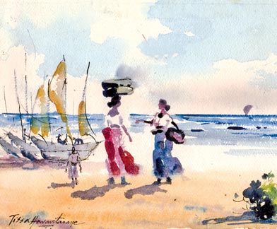
paint over mistakes as you can on oil paint. The beach scene related to
this article was done on a sunny morning. I have titled ‘Conversation’
Observe the clouds and the atmospheric effect of a bright morning.
The two women with their basket on their heads having a conversation
becomes the centre of attraction in relation to their surroundings gives
a dramatic impression of the sheer scale and grandeur of the natural
world.
Notice the fisherman standing on the edge the boats has just reached
the show after a catch and a man standing at a distance brings life to
the picture. When you are painting figures in a landscape it is not
necessary or desirable to make them highly detailed. Challenge yourself
by painting the figures directly, without first drawing a pencil outline
as I have done. You will observe the whole painting does not express any
details including the distant boats anchored by the side. In this
painting the blue colour expresses the smooth glassiness of the water
through the use of contrasts of light and dark tones.
Some of the painting problems, one would experience in water colour
are streaks and runs forming in water-colour washes, for example
painting sky, water, reflections in water, shadows and proper use of
colour mixture. It’s a good idea to try out different water-colour
papers and test how they respond to wet washes. Different papers behave
in different ways, depending on what materials they are made from and on
their surface coating.
Techniques
In water-colour there are four ways to apply paint to the paper; wet
on dry; dry on dry, dry on wet and wet on wet. Generally you should aim
to include at least two different kids of brush-strokes in painting to
give it variety and textural interest.
Dry on dry
When pigment is picked up as dry brush and skimmed lightly over dry
paper, a ragged broken stroke is created. This method known as dry
brush, can be highly expressive in suggesting rough, weathered textures
of the sparkle of sunlight on distant water. Never labour dry-brush
strokes. Use quick light movements. This technique works best on a
medium or rough drawing paper that helps to break up the paint.
Wet on dry
Controlling shapes is easy when you apply paint to dry paper with a
wet brush. The paint remains right where you put it and dries to a
clean, hard edged shape. If over-used, however, the method can make a
painting look rather stationary and lacking in atmosphere. Glazing (coat
with a glossy surface) however, is a wet-on dry method that will catch
any water-colour, painting.
When a thin transparent wash is applied over another dry colour, the
effect is more vibrant than when two colours are mixed together on the
palette. Never attempt a glaze unless the underlying wash is bone-dry,
otherwise the underwash will be disturbed and the colours will mingle
and turn muddy. Always work quickly and lightly when glazing. Don’t
glaze more than two or three layers of colours. Use only the transparent
pigments such as alizarin, crimson and vividian. Opaque pigments such as
cerulean blue and yellow ochore are not suitable for glazing.
Dry on wet
In this method a ‘dry’ brush is loaded with pigment and applied to
wet paper (damp). The applied ‘swims’ on the wet surface before settling
into the fibres of the paper forming a shape with diffused edges.
Because the paint is relatively thick it doesn’t spread too far and
attractive effects are shown while retaining some control over the
shapes you make.
Wet on wet
This is the most beautiful, the most expressive, and least
controllable method. Again the paper is wet, but this time more water is
carried in the brush. The deposited pigment, being more diluted, floods
out and into the wet paper and creates exciting diffusions and colour
interactions that you could never equal if you planned them. To get good
results constant practice is the only way.
www.tissahewavitarane.com
|


")