How to make colour decisions
by Tissa Hewavitarana
I certainly do not suppose it possible to cover the scope of colour
in a single chapter or even in a book of 1,000 pages. I wish to share
some ideas that will provide a foundation on which you can build a more
rational, as well as expressive, approach to making colour decisions.
|
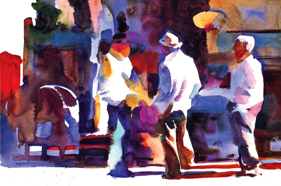
A watercolour painting with light values against dark values. |
At the most basic level, colour is not complicated. Two colours are
placed side by side in a painting. You have the choice of either making
them different, in a limited number of ways, or of keeping them similar.
There are certainly times when one choice is better than the other.
Choices
Poor colour relationships happen when the painter does not consider
the choices. Unfortunate are the painters who paint exclusively in local
colour. They see the sky as blue, the grass as green, the house as white
and the barn as red.
To improve your ability to see colours correctly try this agenda.
Never begin by asking the question "What colour is it?" The answer will
be a one word generalisation too narrow in scope to be of value.
First, determine what value it is somewhere between white and black.
Then determine what temperature it is either warm or cool. Third, ask
what the intensity is somewhere on the scale form pure, intense colour
to neutral grey. You might also answer light, cool pure green. This
approach arms you with much more specific information.
Sensitivity
Having once sensitivity and intelligence identified, the colour of a
shape and placed it on the paper, a series of ducusions is set in
motion. You will want to place a colour next to the first which enhances
both. Keep in mind that contrasts are complimentary.
As dark values make an adjacent light appear lighter, so also a warm
compliments a cool, as pure complements its opposite. Your choices are
limited to value, intensity, temperature or hue changes.
An arrangement of great shapes is essential to a great painting. Once
you have designed the great shapes and drawn them on the page, the next
requirement is that you make them visible. I know this sounds obvious,
it is not.
I have seen hundreds of paintings in which contrast of values,
colours and textures have been reduced to an indistinguishable mush. It
is not necessary to speak loudly, but it is essential to speak clearly.
Value contrast
One approach to making the shapes and patterns of our paintings
visibly clear is seperating them by value contrast. When you do so
colour takes a secondary role. You need only identify what value to make
a shape. Forget the local colour and establish the value contrast that
will make the shapes and composition clear.
It is not necessary to use colour to paint. It is composed with
graphite all the time. The famous Bradywine River Museum exhibits some
of Andrew Wyeth's latest watercolour paintings, which are done with a
warm neutral gray and black ink.
The painting work because of the shapes composition and
draftsmanship, local colour is implied. Since nature's colours tend to
be warm and neutral, Wyeth's palette is effective. It would not work if
the goal was to express the brilliant colours of a flower market.
Impact
Value painters paint and observe with their eyes squinted. The impact
of value painters' work is in the contrast of values and texture. The
best of the value painters do not pretend to be colourists. They avoid
strong colour that compromises the effect of value contrasts. This make
sense, for no amount of colour can compete visually with the effects of
strong value contrast. Make your own declaration. It will make you a
better painter and a happier person. Alternating the temperature of
shapes from warm to cool is a simple and effective way of making the
shapes of your painting read clearly. With this approach, as with any
colour based approach it is not necessary to rely on value contrast.
It is not even advisable to allow value contrast to overide the
subtle beauty of temperatures is not limited to juxtaposing shapes, but
can be used to enhance shapes by layering cool colours over warm and
vice versa.
Values
It has been experienced that every amateur artist and student
generally have to grow along the same route. First is the understanding
of seeing and painting in values, followed by temperature and here,
while awareness of changing intensity relationships comes last.
The next time you go out to paint, look at the subject and instead of
identifying shapes by value or colour, seek out the most intense colour.
Distinguish the range of intensities from the most pure to absolute
neutral, then make a painting that emphasizes an intensity scale.
You will be dazzalled with results. When value wins, colour loses.
This is not to say that colour choices are not important. Value
paintings should have beautiful colour. The painting depicted here the
painting's shapes are visible because of their light values against dark
values. |


")


