|
Learn to draw by Tissa Hewavitarane
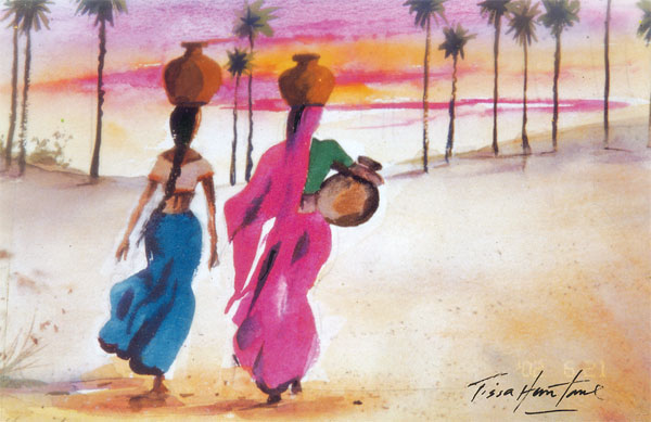
Create an impact with colour
Use colour creatively. Your ability with colour increases as you
become more intimate with your subject. Select all your colours with
affection. Put impact in your design with colour. One important thing
that I have realised is that most people, including myself work better
with limited colours. One soon gets to know them intimately and to know
instinctively how they react with each other just like having a few true
friends as opposed to many acquaintances.
However, there is no meagre selection of colours. The secret is to
cut the number of colours down to the minimum, and learn to mix them
instinctively.
I use a choice of colours, year in and year out, whether in misty,
grey Nuwara Eliya or hot sunny Hikkaduwa. This is one of the most
important factors as far as I am concerned, I certainly use more of Raw
Sienna than any other. It is an earth colour made from mineral oxides
found in natural soil, and is one of the oldest pigments known.
|
In a painting value contrasts are one of the major factors in
the quality of watercolour. |
Painters have used this colour through history. I prefer it because
it is more transparent. I use it in all sorts of mixtures and I feel it
helps me to get a sort of unity in my pictures.
Selection of colours in a painting is dictated by the method of
working. Colour can be realistic adhering to nature as closely or it can
be subjective, with the artist using colour he feels it right at that
time. Most inexpensive colours are rather uninteresting in themselves
and need to be mixed to get satisfying results. This knowledge comes
only by practice and experiments with your set of colours. Muddy colours
result from overwork (too many washes) from scrubbing (using the brush
too much) or by using the more opaque colours.
A full range of colours combined with contrasting values produce a
strong painting.
In a painting, value contrasts are one of the major factors in the
quality of water colours.
The darks make the lights shine and the lights make the darks seem
deeper.
If you look at the natural landscape, you will see hundreds of values
of dark and light.
In painting skies, it need not always have to be blue. A small
intense colour can balance a large muted one. Local colour refers to the
actual colour of a thing, without highlights or shadows.
The values of colour are more important than the colour itself in
making the painting work. Mood colour or super colour is the overall
colour feeling of the painting.
A limited palette with only three or four colours helps eliminate
many colour mistakes in a painting and makes the artists work with
values more carefully. |


")


