Practise colour and design on flowers
by Tissa Hewavitarane
Most of us have experienced the frustration of setting out to capture
the elusive beauty of flowers only to be disappointed with our
ham-fisted attempts. Flowers are so attractive, it's hard to resist the
urge to paint in every detail.
Painting flowers well requires close observation to detail and
constant practice. However, the most essential thing is knowing how to
interpret creatively the particular character of the flowers you have
chosen to paint - whether they be huge exotic lilies or tiny, dainty dew
drops.
 Always try to keep the arrangement of your flowers simple and
informal. Stylised or symmetrical groupings tend to look stiff and
unnatural in a painting. Arrange the blooms so that they overlap each
other and include profile and back views of some of them. This adds
variety of shape as well as accentuating the three dimensional
impression. Allow the flowers to fan out naturally and gracefully, just
as they would do when growing out of earth. Always try to keep the arrangement of your flowers simple and
informal. Stylised or symmetrical groupings tend to look stiff and
unnatural in a painting. Arrange the blooms so that they overlap each
other and include profile and back views of some of them. This adds
variety of shape as well as accentuating the three dimensional
impression. Allow the flowers to fan out naturally and gracefully, just
as they would do when growing out of earth.
Mixing colours
Freshness and clarity of colour are essential in flower painting, so
be sure that you are familiar with your pigments and how they mix
together. Flowers may be colourful, but you don't need a vast array of
pigments to paint them.
Flower forms are built up from light to dark with glazes of warm and
cool colour. When choosing your colours, avoid the more opaque ones such
as ochre in favour of the really transparent ones like a lizarin
crimson, lemon yellow and rose dose. When mixing colours don't use more
than two or three pigments, otherwise the colour will turn muddy and
opaque.For maximum vibrancy, build up the forms of petals and leaves
with thin glazes of warm and cool colours that allow the light to
reflect off the paper.
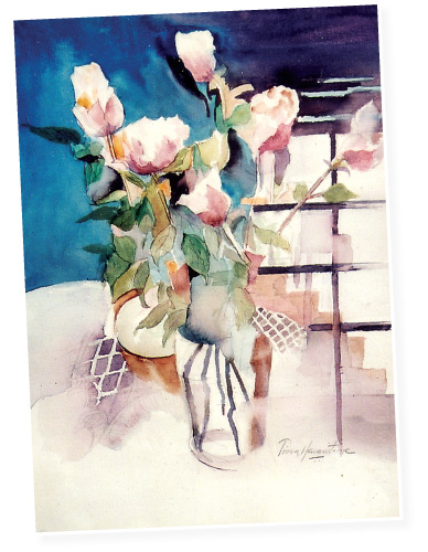
Flowers that are shown here have a simple charm that is perfectly
captured delightfully. Note the delicate pink to adorn them against the
backdrop of prussian, blue as colour contrast.
A subtle delicate combination makes colour become less distinct and
it is then easier to see where the light or dark tones fall.
I also take great care to shade the base of the petals and where the
flowers overlap each other to add definition. Too many or heavy-handed,
washes of colour could destroy their transparency.
Once this stage is reached I begin to add the final details, such as
stems, tiny hairs and soft green leaves using No. 1, 2 Sable hair
brushes.
Notice the ridged quality of the stems which is completed with a
mixture of burnt sienna and blue or Vandyke brown. The leaves are washed
with a delicate combination of sap green, lemon yellow and Hooker's
green. |


")


