Using colours in watercolour medium
by Tissa Hewavitarane
The selection of colour in a painting is dictated by the method of
working. Colour can be realistic, adhering to nature as closely as
possible, or it can be subjective, with the artist using colour he feels
is right at that time. Between these two extremes exists a wide range of
possibilities depending on the purpose and make-up of the artist.
Several aspects of colour have special interest to watercolourists its
use mixing combinations and applications to specific situations.
 |
|
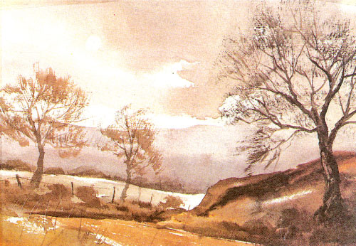
A painting with a limited
number of colours |
As you are aware, watercolour is a transparent medium. It dries
lighter and should therefore be applied a bit more boldly than other
paints adding this 'extra' bit of intensity is called 'charging', the
colour. Often it is done by brushing almost pure colour into a wet
colour area of the painting giving it a chromatic boost. Wet a few
squares and flow light washes into them and then charge with intense
colour. Mingle the colours but don't overwork them. Overlay washes often
result in fascinating colour changes.
A colour can be grayed, if it is too intense by putting a
complimentary colour over or by mixing the two in the palette. Don't use
black to tone down intensity. Never use black in their palette
preferring to make a darker colour by mixing. Black often has a opaque
look and tends to seem foreign to the rest of the colours. Most
inexpensive colours are rather uninteresting in themselves and need to
be mixed to get satisfying results.
This knowledge only could be acquired from practice and
experimentation with your set of colours. Muddy colours result from
overwork (too many washes), from scrubbing (using the brush too much) or
from using the more opaque colours. Such areas can be helped or saved by
line out the area with a sponge, stiff brush. This lets the dull area
breathe again and brings it to life. Sometimes an opaque line or
pattern, laid over the area can spark it to life.
However, there is no magic selection of colours. Most artists
including myself, work better with a limited number of colours. The
secret is to cut the number of colours down to the bone and then learn
to mix them instinctively, allowing the main part of your concentration
to be devoted to solving the problem.
Of course, if you use a different range of colours to be mixed
allowing more room to move your paint around with complete freedom,
while leading plenty of space for other mixes. The first thing, before
you even start to mix paint, is learn to compare the various colours
with each other. With constant practice in colour mixing you will learn
to use the creative use of colour and will show you how to control
colour relationships to create better paintings. |


")


