Keeping colours from turning muddy
by Tissa Hewavitarane
No other medium can quite match up to the unique freshness and
delicacy of watercolour - that is, if you know how to handle
watercolours properly. For any beginner it can be frustrating when
colours that sparkle like jewels on the palette and end up looking like
mud on paper.
 |
|
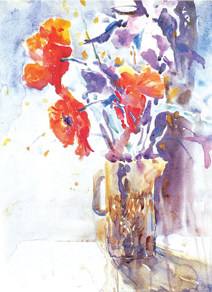
A floral arrangement filled with radiant
light colours. |
Why do things go wrong? The muddy colour is the result of 'muddied'
thinking. In an effort to make something look 'real' the inexperienced
painter tends to fiddle about on the paper, pushing and prodding the
paint and building up dense chalky layers of colour and that makes it
look muddy.
When mixing colours to create a particular colour, don't be tempted
to blend them so thoroughly that they become flat and lifeless. Colours
partly mixed on the palette, so that the original pigments are still
apparent, have a much livelier colour vibration. Try placing the pure
unmixed pigments on damp paper and blending them just slightly so that
they fuse together wet-in-wet. To keep it clean when pure, unmixed
colour is brushed on to white paper and allowed to settle undisturbed,
the effect is clear and luminous. Don't prod, poke or dab or scrub your
colours once they are on the palette. Be sure of the colour you want
before applying it, then brush it on quickly and confidently.
Watercolour painting is like playing golf, the fewer strokes you use,
the better. For some reason, novice painters usually feel compelled to
obliterate every inch of the paper with colour, yet more often than not
the light reflecting surface of the paper itself has a positive part to
play in the freshness and spontaneity of a watercolour painting.
Layers of transparent colour applied in thin glazes build up form
without looking heavy and overworked. Areas of bare paper reflect light
and act as breathing spaces. Pools of colour mixed wet-in-wet set-up
warm cool colour vibrations. Thin transparent glazes allow light to
reflect off the paper and up through the colours, giving them greater
clarity and vibrancy.
Observe the floral arrangement which is shown here, filled with
radiant light colour and excitement. Here the artist has built up his
colours with thin transparent glazes, like delicate layers of tissue
paper, so that they retain their freshness and sparkle.
Floral still life offers you exciting opportunities for creating
dynamic compositions. Experiment with unusual view points. Try out
different backgrounds. Explore the potential of colour interactions. It
is the uniqueness of your correct colour mixing that will make a
excellent painting. |


")

