|
Painting 101:
Experiment for success
by Tissa Hewavitarane
To have a shape that maintains its identity and is also visually
exciting, you should keep the values close within the shape and make
numerous colour changes. The logic is that as the contrast of one
element is reduced, you become free to exaggerate the contrast of
another element.
It's true, if you take a sheet of water colour paper and paint every
inch of it with as many varieties of red as you can - light red, dark
red, intense-red and neutral-red, does the page have dominance and
visual excitement? Take another sheet of paper and paint it all value
three (very light), but make as many colour changes as you possible can.
Does the page have dominance and visual excitement? Take another sheet
of paper and paint it all value three (very light), but make as many
colour changes as you possible can. Does the page have dominance and
visual excitement?
Insight
This exercise can provide you with a wealth of insight into your
painting, for it is probably a micro review of how you paint everything.
From the total composition to the smallest detail there is a delicate
balance of unity and variety. When colour contrasts were limited, value
were unlimited. People who limit their palette to three colours are
ensuring unity through dominance of colour, but they rarely achieve a
spectacular colour, presentation. Those who throw everything imaginable
at the paper without concern for unity, create chaos. Let's begin by
handling one shape and later address how to apply these ideas to the
total composition. First there is the shape a shape that has been
created with concern for aesthetics, visual interest, placement, size
and charity of statement. Certainly a shape that is the expression of
such profound and genuine thought should not be destroyed through
careless handling.
|
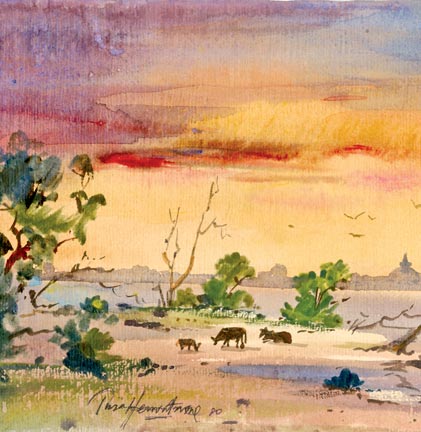
A landscape in the Central Province. |
One approach to saving the identity of this shape is to decide on a
value range (right middle or dark value). Having said that, you are free
to explore an infinite number of colour changes. It is quite impossible
to exaggerate colour changes so long as the value change are very close.
Intensity shapes
Colour dominance can be achieved by limiting the intensity contrast
range within a shape. At one end of the intensity spectrum are the most
intense colour possible. Select the most brilliant pigments on your
palette and use them full strength. Like most extremes, the results of
this exercise have limited audience appeal. One level down from this
approach you slightly reduce the intensity of all pigments. Continue
with this sequence and you eventually get mixtures of complements that
are absolutely neutral gray. All along this scale are colour intensity
ranges suited to exactly what you want to express about specific
subjects. I strongly suggest you explore the intensity scale, just as
you have studied the value scale, and make it part of your painting
vocabulary. One approach to mixing neutral and near neutral is to mix a
pool of primaries (red, blue and yellow) until all colour identification
is possible.
Changing value
Limit the colour range and you can go wild with value changes. As a
matter of fact, if you limit the colour, you better go wild with value
contrast. Consider about the artists who limit the colours in their
work. Are they not the same people who exaggerate, value contrasts in
their paintings, working from white to black? It's really quite simple.
As you exaggerate the contrasts within one element, you must reduce the
contrasts within another. There are many ways to limit the colour range
of a shape. You may decide on the colour, say for instance blue, or a
limited range of colours (blue, the green and blue violet.)
It is an easy jump from these blues to limiting your colours. This
allows you to add greens and violet and occasional touch of red-violet
or yellow green. You may decide on a mixture of colours that allow you
to make a wide range of value changes and subtle changes of warm to cool
temperatures while still limiting the colour range. Yellow ochore, burnt
sienna and ultramarine blue form a trial that fits this bill, as does
any triad of colour complements.
Transparent medium
For the watercolour it is different because we must keep the light
colour a lighter value so as not to make the second wash look green. We
are working with a transparent medium. I wish to express a time of that
day. One way is the use of 'light' itself, the colour of the light all
over the sky.
I change the yellow where the sun is in the sky, using a pure light
yellow and as we move away from the sun, I add a little red or orange
ever so lightly to this colour. If the atmosphere is heavy, I then add a
reddish tone again very light at the horizon.
When painting clouds, the procedure I use is to warm the paper first
slightly a very lighter colour than the light as they are white clouds
so far away. Special situations call for certain pigments. When painting
the sky, for example, you need pure, clean and intense colour. Different
kinds of light also call for new colours.
Demonstration
You should bear in mind that in each demonstration the light changes,
but the painting procedure remains the same. That's the rule of the
game. Observe the painting. I have done of a landscape in the Central
Province with a lake. It is titled "Evening Shadows".
As you can see, the background contains a variety of dark shades and
light wash towards the horizon. The sky is painted with a mixture of
violet and orange, conveying the tranquil mood that prevails at the
close of the day.
The trees are painted wet-in-wet to give a pleasing mistiness at the
close distance with a mixture of olive green while the two trees and
branches of trees merely suggests using dry brush strokes. Notice the
lakeside scene with three tiny figures of animals giving a dramatic
impression of the sheer scale and grandeur of the natural world. You
should experiment to find all the techniques available.
Do practice these techniques although they probably won't come off
best at first.
www.tissahewavitarane.com
|


")

