Landscape light in watercolour
by Tissa Hewavitarane
Light is the life of a painting whatever medium you paint.
Watercolour, therefore, is the ideal medium that is fresh, alive and
responsive to the moment and shifting moods of nature. As we have
observed, nature is always changing and we as painters must study and
paint each colour and value carefully and accordingly. The earth depends
on the value and the colours of the sky.
We must always be aware of the effect that light has on our painting.
Depending on the nature of the day, reflected light can be a very
important part of your picture. The strong light of a clear day, for
example, reflects colour into every thing.
At a beach, the brilliant sun bounces light off the sand into the
surrounding darks obliterating them. On a very dull day, however, such
effects are more subtle, the reflected light is much harder to see.
Middle values
The arrangement of values is very common. It is a clean, clear and
dramatic presentation of any subject. Most traditional landscapes
feature a light and middle value sky against a darker shape of the land.
More contemporary examples in water colour include fish of Joseph
Raffeel and the nudes of Charles. Reid.
 Do not confine yourself to use this value design when appears to be
the only and obvious choice. If you ascertain that a dark shape would be
better expressed as if light and middle value shape, then by all means
do it. Do not confine yourself to use this value design when appears to be
the only and obvious choice. If you ascertain that a dark shape would be
better expressed as if light and middle value shape, then by all means
do it.
The flopping of light, middle and dark values is a fundamental part
of your design vocabulary and should be used liberally. Transposing
values is a simple procedure. What is offered as a dark shape made of
middle and dark values is transposed into a shape in which what had been
middle value is now light, and what had been dark is now middle.
Just as outrageous colours sometimes prove the best so also the
alternative value organisations.
Dark and light value
On three basic value organisations offered, this option is
potentially the most dramatic and also the most difficult. Dramatic
because of the strong contrast that happens on the major subject matter.
Difficult because of the strong contrast can fracture the subject into
two unrelated shapes.
When the contrast between the light value the focal point and the
middle value of the background are too close, the light value and the
middle value of the background are also too close, the light value and
the middle value join, and the dark shape is isolated. In other words,
the light and middle become shape stands alone.
The same problem occurs when the dark and middle values get close.
The critical factor is the values that surround the focal point. The
light is too dark and they won't work. Objects in direct strong sunlight
are frequently defined as light and dark against middle values is a
white in sunlight.
The white in sunlight is lighter than the sky and the white in shadow
is darker than the sky. Once you decide to use the patterns, you must
remain consistent. It's easy to get confused by local colour and find
yourself vacillating between patterns at one time painting the shadow of
the house darker than the sky and out other times lighter than the sky.
There seems to be a belief that if a paint matches each colour
exactly as seen reality will be the result. Nothing could be further
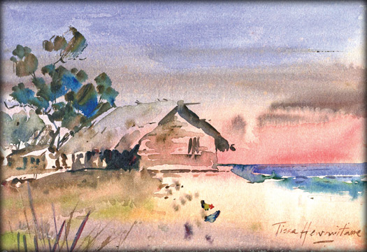
from the truth. Observe the painting I have done the sun about to set.
If you see the colour of light, which exist and only colour which
emerged is mainly red.
Expressive colours
To express my view on a sunset scene, the sky at sunset takes on a
radiant glow. Notice the colours used the warm pink of the setting sun
with cool bluish purple colour gradiantly to the strong tones. I have
used subtle modulation of colour texture and tone to create a lively
impression of the sea shore adding a fisherman's hut and few cock birds
picking food.
Dark tones
To make the picture more live two figures in dark tones chatting
inside the hut. The trees gives a more rich look to improve the quality
of the picture. I felt the best way to describe the sunset with strong
light using pure clear transparent pigments thus increasing the
impression of light and luminosity.
A light wash indicates the fisherman's hut. Remember colour is an
equal and essential partner in portraying light. It is not enough to
squint your eyes and see only values. You must look into the shadows and
identify the colours that are there.
Do not look for formula or short cuts to tell what colours to be
used. Shadows should be or always are. Look for the warm colours in the
shade and cools in sunlight. It takes some practice to allow your eyes
to see shapes, values and colours.
Absorbent and reflective surface can coll the eyes from seeing light
and shade.
The value relationship of light and shade can be altered to create
desired effects.
Do not allow your brain to blind your eyes. |


")

